

Quantifying point overlap for NBA shot chart data
I saw this article about similarities and differences between NBA rookies Trae Young and Luka Doncic, and it made me wonder if parts of their game could be summarized and compared using shot chart data.
Back in 2016 I wrote about using Cardillo and Warren’s point-proximity metric (O) to measure spatial point overlap. The metric was developed for evolutionary ecology, but I thought I could try it out on XY shooting data for various pairs of players.
To summarize shot chart data, I went with a grid-cell approach to identify the spots on the courts where each player was taking the most shots. That way I could reuse what I learned when I explored grid-based richness metrics for spatial data using the sf package, together with the code I used recently to access and plot NBA shot charts.
All the code is in the gist at the end of the post, and the code should be fully reproducible as long as the relevant packages are installed.
Below are the main steps in the workflow. Instead of copying and pasting extensively, I rolled some of the steps into functions that take lists and iterate over data frames of shot chart data for many players. The functions are pretty rough, and it was my first writing functions using purrr instead of for loops. I’m mostly comparing data from the ongoing season for point and shooting guards, but I added some of my favorite players from past seasons just for fun.
All shot chart data corresponds to the 2019 season, except for the three Knicks legends (1999 season).
| label | namePlayer |
|---|---|
| AH | Allan Houston |
| BS | Ben Simmons |
| DR | D’Angelo Russell |
| JT | Jayson Tatum |
| JB | Jimmy Butler |
| JE | Joel Embiid |
| KI | Kyrie Irving |
| LJ | Larry Johnson |
| LS | Latrell Sprewell |
| LBJ | LeBron James |
| LD | Luka Doncic |
| TY | Trae Young |
Workflow:
- Download shot chart data and subset by player names.
- Count the number of shots per cell on a custom grid overlaid on the court.
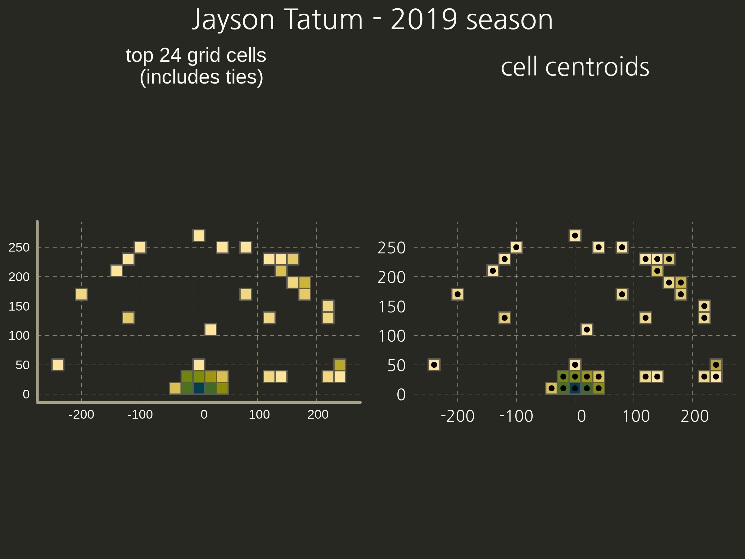
- Identify the top n highest-density grid cells and get their centroids.

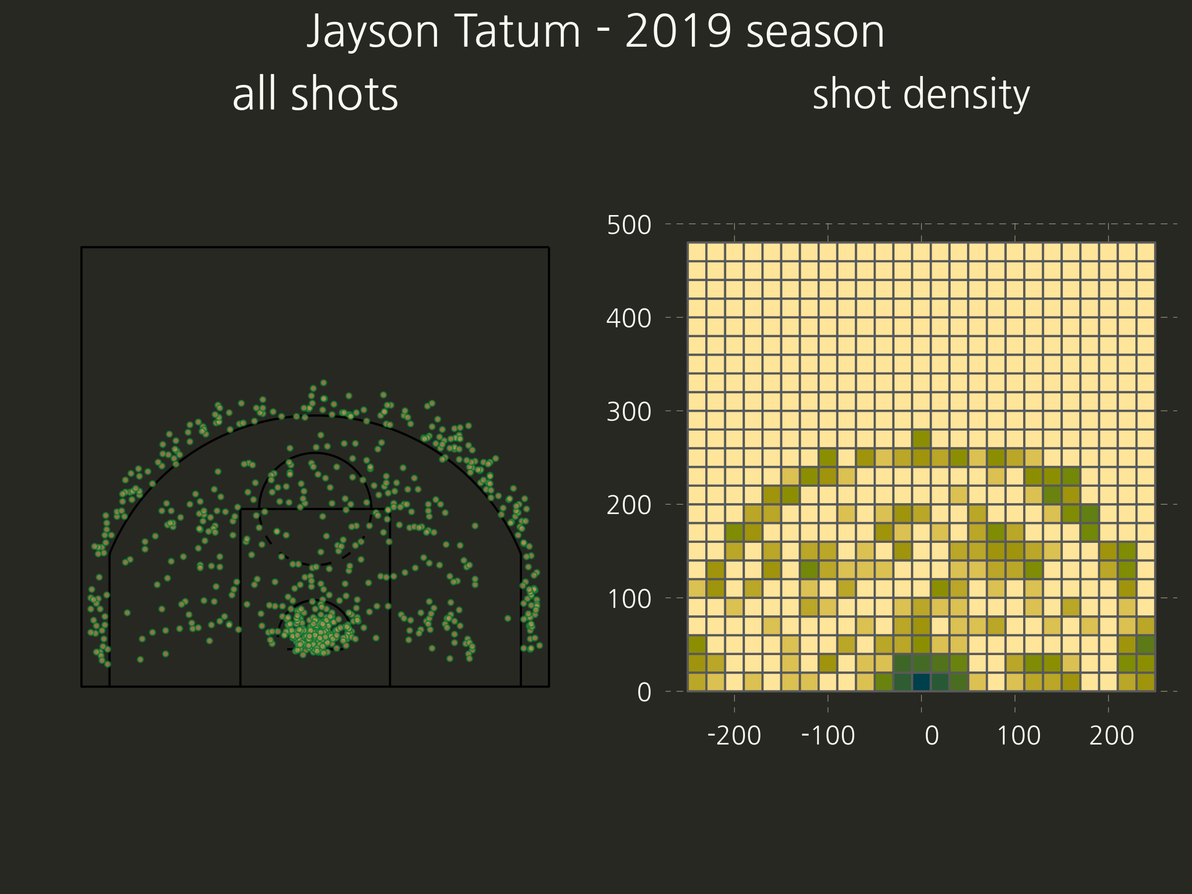
- Once we have a court as a simple feature object, we can overlap a grid on in and get the shot richness. Here’s an example of the intermediate steps involved, shown for only one of the players.
- Now the ‘top’ cells and their centroids.
- Finally, calculate O for every combination of two players.
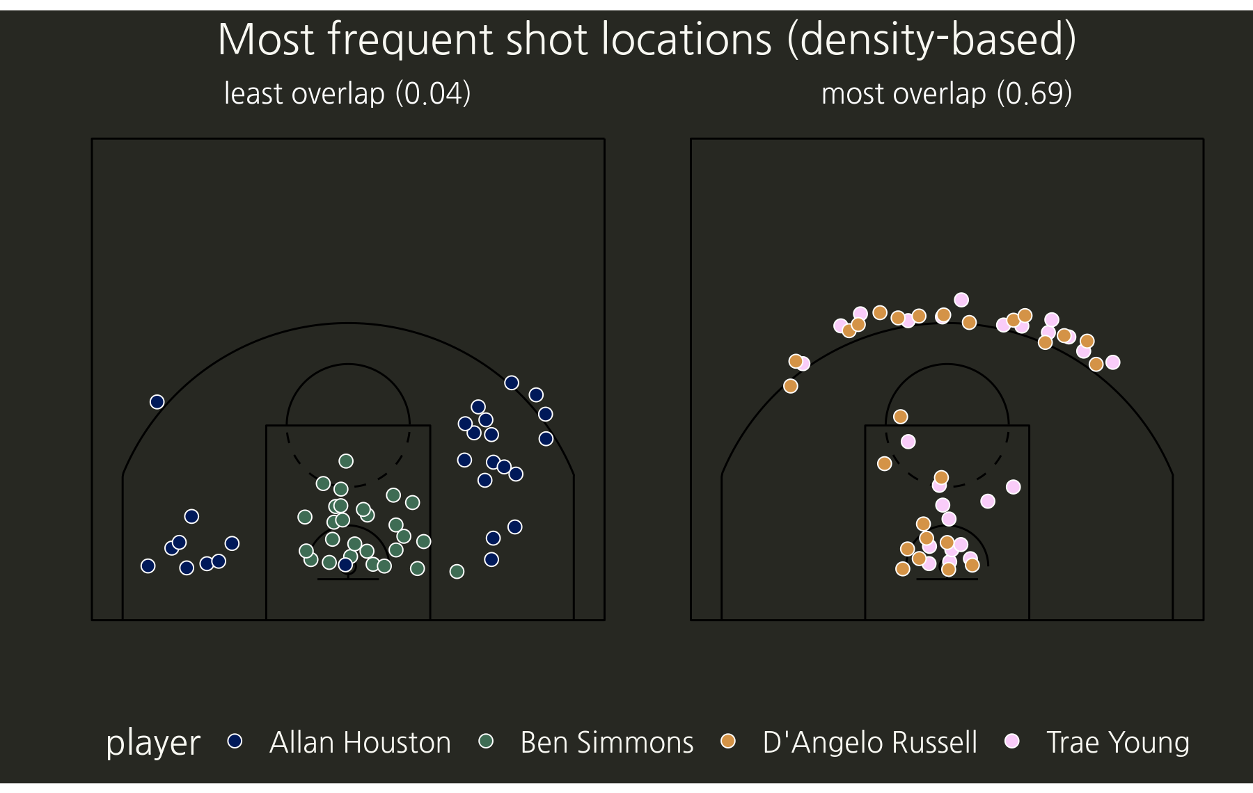
The value of O is bounded between 0 and 1. Values close to zero indicate little spatial overlap, while a value of ~0.5 is expected if the occurrence points of the two samples are randomly and independently distributed across the same area. In the intended implementation of the O metric for co-occurring species, values between 0.5 and 1 would be possible in cases of strong intraspecific competition, but in this case these values > 0.5 would more or less indicate spatial clustering of the two samples. Broadly, the highest and lowest values in the matrix of pairwise comparisons would show us the most and least overlap in shooting ‘preferences’, which can then be plotted.
- Subset the data for the pairs with the highest and the lowest values (most and least spatial overlap).
- Plot the shot centroids (with some jitter to show any overlapping grid centroids).
To get an idea of the rest of the pairwise comparisons, we can draw the matrix of all pairwise comparisons using the new gt package (this is a screenshot, the functions for exporting gt objects as images seem to be in development).

I didn’t test the sensitivity of this approach to the size of grid cells, and to the number of top shots specified. For more fun and interactivity, this is the kind of project that could be made into a Shiny app but I lack the time and expertise, so contact me if you’d like to collaborate.
Keep ballin’
The code: