
Here’s one approach for plotting a set of faceted stacked barplots showing the output from popular software and methods (e.g. Structure, DAPC, or Admixture) used for population genetics/genomics and phylogeography. This code may come in handy when plotting individuals from different locations and models with different numbers of proposed ancestral populations.
To make the plots with made up data, let’s write a quick function to generate random proportions for an arbitrary number of proposed ancestral populations and samples. We can leverage the ‘long’ output from tibble’s enframe function and end up with a ggplot-ready tibble. For real data such as Admixture Q files, this table shape can also be accomplished easily with the tidyr::gather function (and its upcoming replacement).
library(dplyr)
library(tibble)
library(purrr)

# define function
generateRandomK <- function(k, nsamples) {
  randomprobs <- function(k) {
    probsout <- diff(c(0, sort(runif(k - 1)), 1))
    enframe(probsout)
  }
  probsdf <- map_df(1:nsamples, ~randomprobs(k))
  probsdf <- mutate(probsdf, sampleID = rep(1:nsamples, each = k))
  probsdf <- select(probsdf, sampleID, popGroup = name, prob = value)
  return(probsdf)
}
Next, we simulate random data for K = 2, 3, and 4, and merge it with some random ‘locations’ for the sampled individuals. Here I simulated data for 131 individuals in five generic locations.
# random location data
# we want it to be consistent for all values of k with the same number of samples
locations <- c("EAST", "WEST", "NORTH", "SOUTH", "UNKNOWN")
locdata <- tibble(
  sampleID = 1:131,
  loc = sample(locations, 131, replace = TRUE)
)

# generate data for k=2
kdf2 <- generateRandomK(k = 2, nsamples = 131)
kdf2 <- left_join(kdf2, locdata)

# now for k=3
kdf3 <- generateRandomK(k = 3, nsamples = 131)
kdf3 <- left_join(kdf3, locdata)

# for k=4
kdf4 <- generateRandomK(k = 4, nsamples = 131)
kdf4 <- left_join(kdf4, locdata)
A quick glimpse of the resulting tibbles shows us how the plotting variables (x, y, fill, and facet) are ready for ggplot.
> kdf2
# A tibble: 262 x 4
sampleID popGroup prob loc
<int> <int> <dbl> <chr>
1 1 1 0.0517 WEST
2 1 2 0.948 WEST
3 2 1 0.881 NORTH
4 2 2 0.119 NORTH
5 3 1 0.0853 WEST
6 3 2 0.915 WEST
7 4 1 0.0849 SOUTH
8 4 2 0.915 SOUTH
9 5 1 0.615 WEST
10 5 2 0.385 WEST
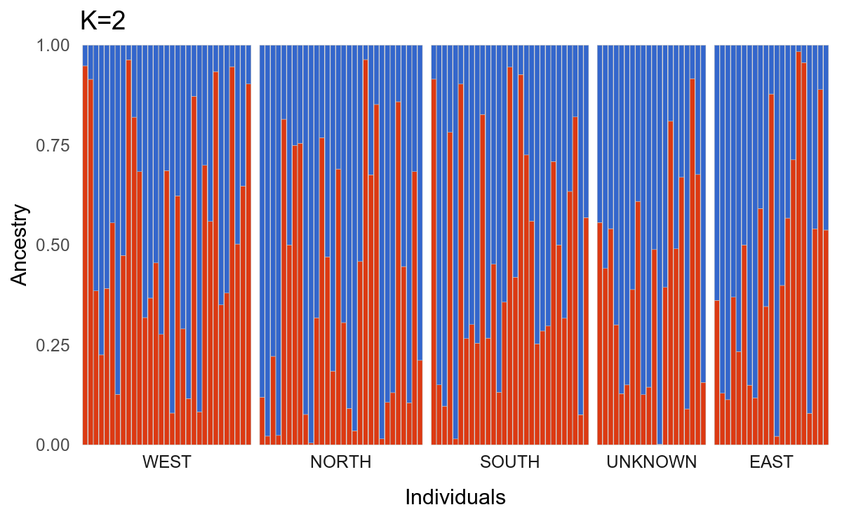
# … with 252 more rowsNow we can start plotting. The suitable geom here is geom_col because we want the bars to add up to 1. This approach lets us control the spacing of different locations by using facets, the expand argument for the scales, and the panel.spacing argument for the overall plot theme. Note how the scales and space arguments to facet_grid help us accommodate the different number of individuals per location. Switch places the facet labels below the plot. We can use fct_inorder from the forcats package to avoid alphabetic arrangement of the facets.
# plotting
library(ggplot2)
library(forcats)
library(ggthemes)
library(patchwork)

k2plot <-
  ggplot(kdf2, aes(factor(sampleID), prob, fill = factor(popGroup))) +
  geom_col(color = "gray", size = 0.1) +
  facet_grid(~fct_inorder(loc), switch = "x", scales = "free", space = "free") +
  theme_minimal() + labs(x = "Individuals", title = "K=2", y = "Ancestry") +
  scale_y_continuous(expand = c(0, 0)) +
  scale_x_discrete(expand = expand_scale(add = 1)) +
  theme(
    panel.spacing.x = unit(0.1, "lines"),
    axis.text.x = element_blank(),
    panel.grid = element_blank()
  ) +
  scale_fill_gdocs(guide = FALSE)
k2plot
The above code produces this:
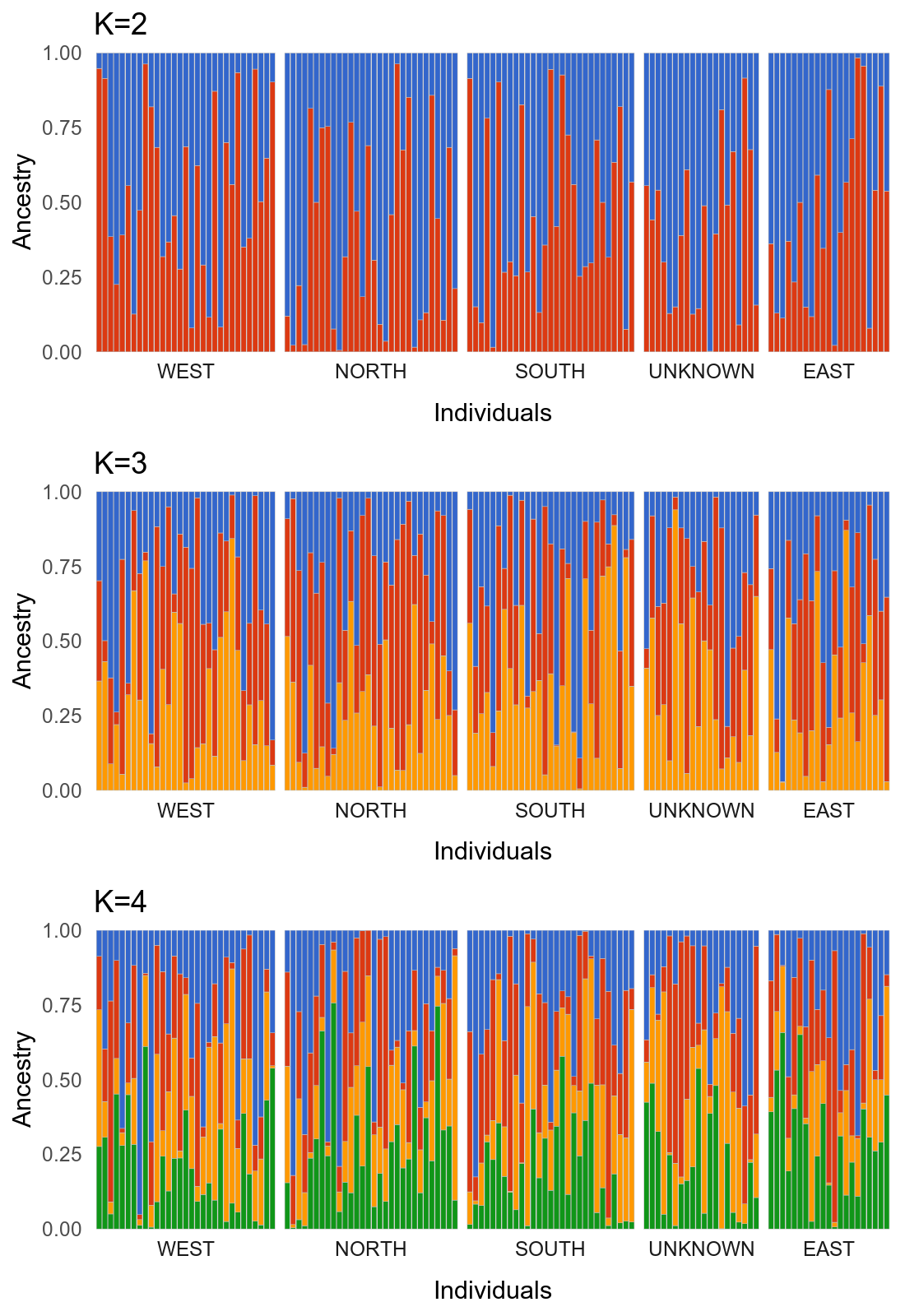
After making some minor aesthetic choices, we can stack the plots for the different values of K in a single figure using patchwork.
k3plot <-
  ggplot(kdf3, aes(factor(sampleID), prob, fill = factor(popGroup))) +
  geom_col(color = "gray", size = 0.1) +
  facet_grid(~fct_inorder(loc), scales = "free", switch = "x", space = "free") +
  theme_minimal() + labs(x = "Individuals", title = "K=3", y = "Ancestry") +
  scale_y_continuous(expand = c(0, 0)) +
  scale_x_discrete(expand = expand_scale(add = 1)) +
  theme(
    panel.spacing.x = unit(0.1, "lines"),
    axis.text.x = element_blank(),
    panel.grid = element_blank()
  ) +
  scale_fill_gdocs(guide = FALSE)


k4plot <-
  ggplot(kdf4, aes(factor(sampleID), prob, fill = factor(popGroup))) +
  geom_col(color = "gray", size = 0.1) +
  facet_grid(~fct_inorder(loc), scales = "free", switch = "x", space = "free") +
  theme_minimal() + labs(x = "Individuals", title = "K=4", y = "Ancestry") +
  scale_y_continuous(expand = c(0, 0)) +
  scale_x_discrete(expand = expand_scale(add = 1)) +
  theme(
    panel.spacing.x = unit(0.1, "lines"),
    axis.text.x = element_blank(),
    panel.grid = element_blank()
  ) +
  scale_fill_gdocs(guide = FALSE)


k2plot + k3plot + k4plot + plot_layout(ncol = 1)
The output should look like this:
The plots with simulated data probably look hideous to anyone who studies real populations (given the lack of structure), but this should be a useful outline for those who have real data. Thanks to urban evolutionary biologist Liz Carlen for the inspiration. Feel free to contact me with any feedback or questions.
LD