

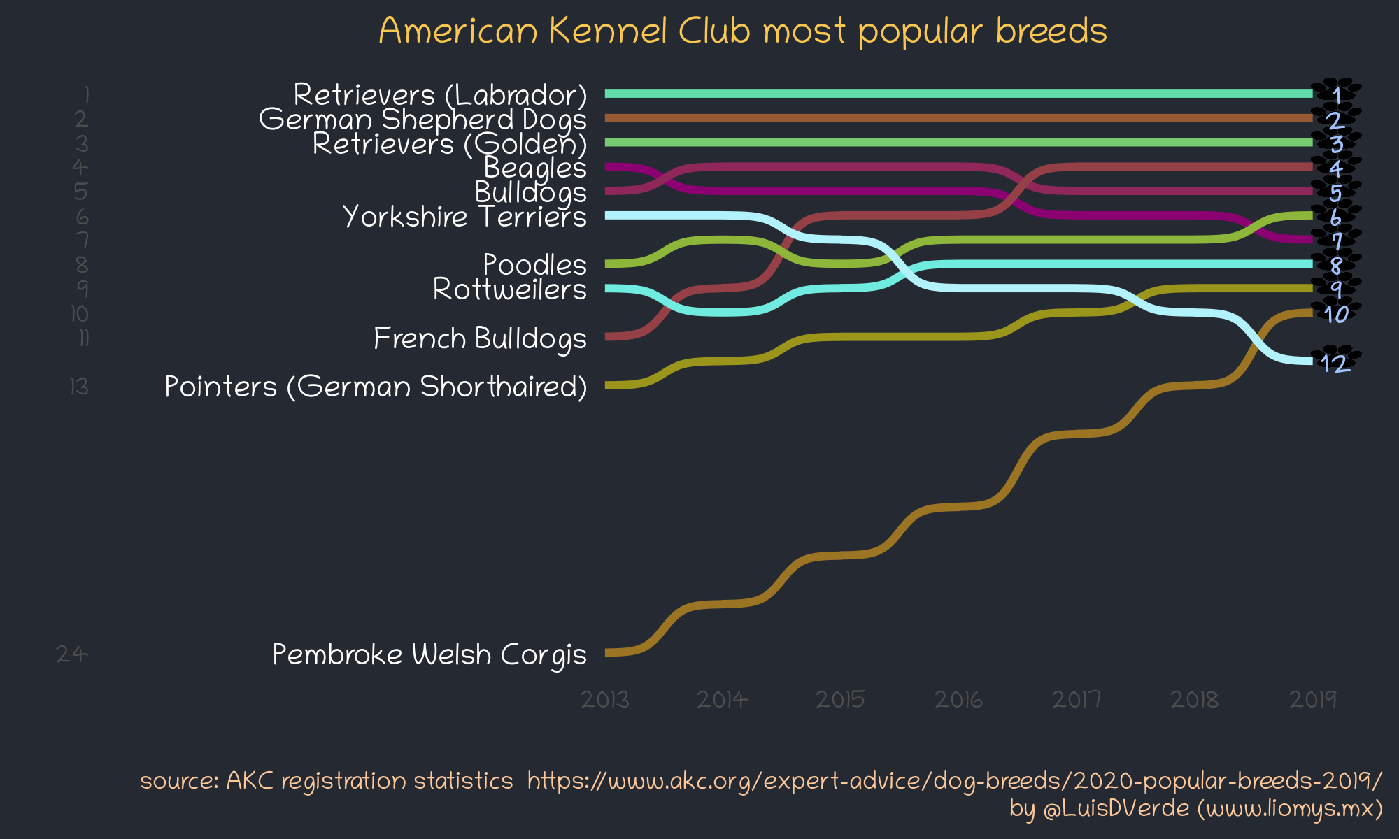
Dog breed popularity bump chart
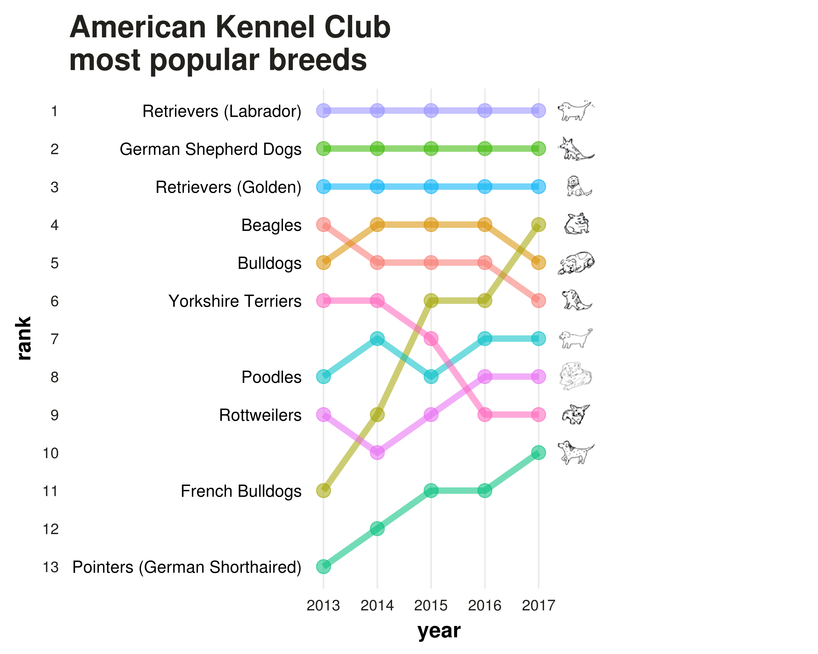
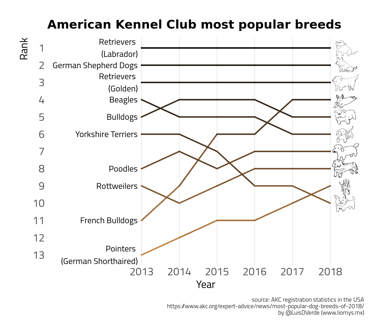
The American Kennel Club recently published the 2019 rankings of dog breed popularity, collected from registration data in the USA.
For the 2017 and 2018 rankings, I created bump charts in R using ggplot2 to show changes in rank over time, following the work of Dominik Koch.
The code for the 2017 and 2018 versions (below) is detailed in these posts:
With the new rankings out, here’s another (p)update. By now there is a specific geom for bump charts thanks to the ggbump package by David Sjoberg. The code for the updated chart is in the gist at the end of this post and should be fully reproducible. This approach uses both the wide and long formats of the data, a darker theme, and makes use of scale_y_reverse(), which I was previously unfamiliar with.
…and here’s the updated plot:
Thanks for reading. Let me know if anything isn’t working and be nice to dogs.
The code: