
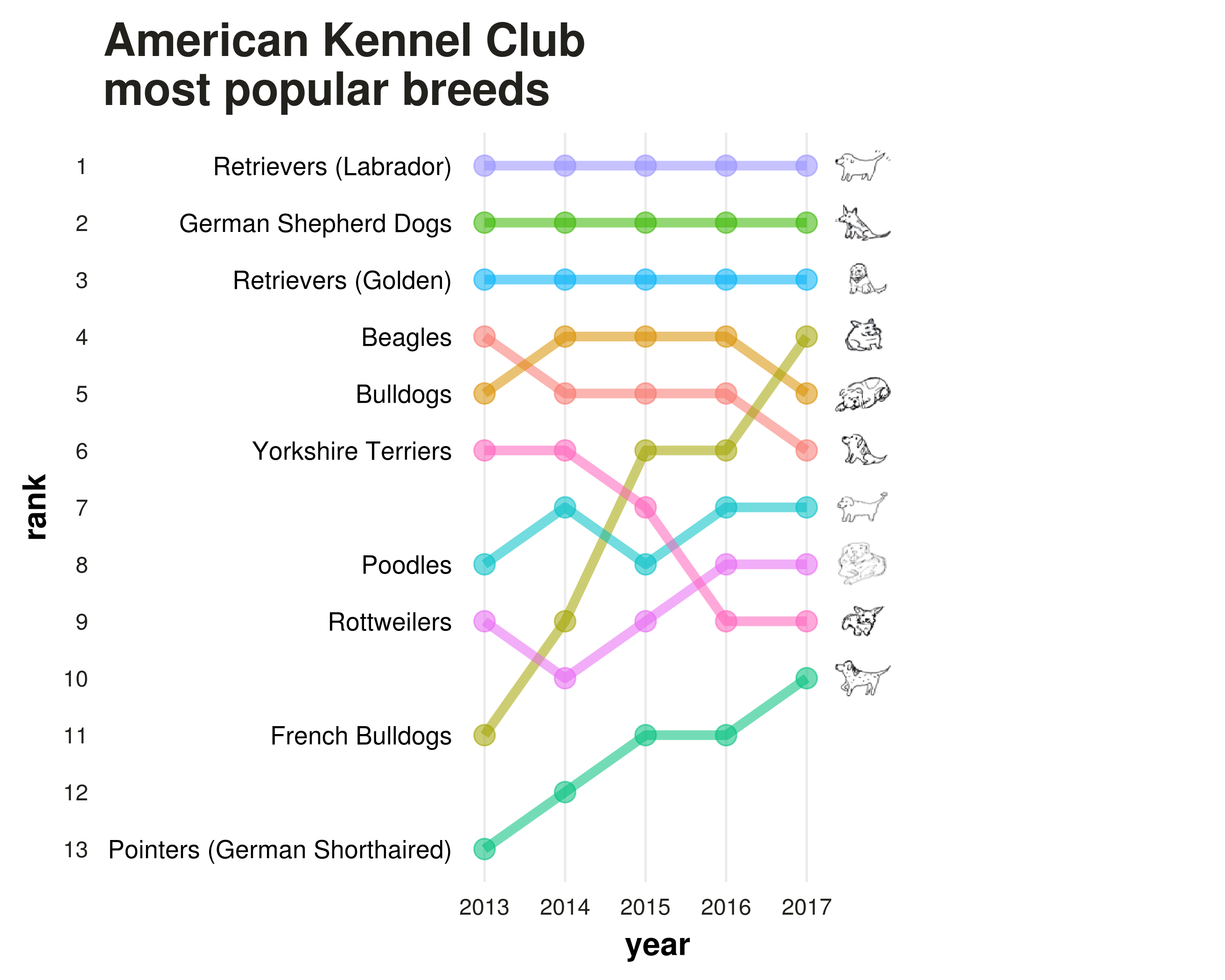
Dog breeds bump chart
Last week, the American Kennel Club announced the 2017 rankings of dog breed popularity in the USA. A few days later, Dominik Koch blogged about creating bump charts in R using ggplot2 to show changes in rank over time.
The ACK also released an update (a.k.a. pupdate) to the full list of breed rankings from 2013 to 2017, and it looked like a good dataset to try out the code for making bump charts.
For this post, I was only interested in the top ten breeds of 2017 and how they’ve changed in ranking since 2013.
In the original bump chart example with Olympic medal rankings, countries are labeled using little flags and the ggflags package. I wanted to use custom images as labels, and the ggimage package worked out great for that. I’ve written code to scrape and download dog photos by breed in the past, but for this post I drew each dog by hand.
Side note: I used this nifty function by Maëlle Salmon for batch resizing images using the packages purrr and magick. I uploaded all the drawings here.
library(magick)
library(purrr)
# batch resizing fn from Maëlle Salmon's blog
reduce_image <- function(path){
  magick::image_read(path) %>%
    magick::image_scale("50x48!") %>%
    magick::image_write(path)
}
purrr::walk(dir(here(),full.names = T),reduce_image)
Get the data
To import the rankings into R, I used Miles McBain’s datapasta addin to smoothly copy and paste the first ten entries directly from a web browser to my source script in RStudio. The variable names for the different years needed some editing, but everything else stays as is.
library(dplyr)
library(tidyr)
library(ggplot2)
library(purrr)
library(ggimage)

# from clipboard, using the datapasta addin
dogranks <-
data.frame(stringsAsFactors=FALSE,
       Breed = c("Retrievers (Labrador)", "German Shepherd Dogs",
                 "Retrievers (Golden)", "French Bulldogs", "Bulldogs",
                 "Beagles", "Poodles", "Rottweilers", "Yorkshire Terriers",
                 "Pointers (German Shorthaired)"),
   r2017 = c(1L, 2L, 3L, 4L, 5L, 6L, 7L, 8L, 9L, 10L),
   r2016 = c(1L, 2L, 3L, 6L, 4L, 5L, 7L, 8L, 9L, 11L),
   r2015 = c(1L, 2L, 3L, 6L, 4L, 5L, 8L, 9L, 7L, 11L),
   r2014 = c(1L, 2L, 3L, 9L, 4L, 5L, 7L, 10L, 6L, 12L),
   r2013 = c(1L, 2L, 3L, 11L, 5L, 4L, 8L, 9L, 6L, 13L)
)
To annotate the plots with my own dog drawings, I simply needed to add a variable containing the filenames that correspond to each breed. After that, wrangling the data into a long form suitable for making the bump chart was pretty easy thanks to various functions from dplyr and tidyr. The image files are in the working directory.
# reorder years
dogranks <- dogranks %>% select(Breed,rev(everything()))
# variable with corresponding image filenames
dogranks <- dogranks %>%  mutate(drawing=paste0(sprintf("%02.0f", 1:10),".png"))
# reshape
rankslong <- dogranks %>% gather(year,Rank,-Breed,-drawing)
# clean up
rankslong$year <- gsub("r","",rankslong$year)
Customizing the plot appearance
I used the same custom theme as Dominik, which looks pretty good already.
# custom theme by Dominik Koch
my_theme <- function() {

  # Colors
  color.background = "white"
  color.text = "#22211d"

  # Begin construction of chart
  theme_bw(base_size=15) +

    # Format background colors
    theme(panel.background = element_rect(fill=color.background, color=color.background)) +
    theme(plot.background  = element_rect(fill=color.background, color=color.background)) +
    theme(panel.border     = element_rect(color=color.background)) +
    theme(strip.background = element_rect(fill=color.background, color=color.background)) +

    # Format the grid
    theme(panel.grid.major.y = element_blank()) +
    theme(panel.grid.minor.y = element_blank()) +
    theme(axis.ticks       = element_blank()) +

    # Format the legend
    theme(legend.position = "none") +

    # Format title and axis labels
    theme(plot.title       = element_text(color=color.text, size=20, face = "bold")) +
    theme(axis.title.x     = element_text(size=14, color="black", face = "bold")) +
    theme(axis.title.y     = element_text(size=14, color="black", face = "bold", vjust=1.25)) +
    theme(axis.text.x      = element_text(size=10, vjust=0.5, hjust=0.5, color = color.text)) +
    theme(axis.text.y      = element_text(size=10, color = color.text)) +
    theme(strip.text       = element_text(face = "bold")) +

    # Plot margins
    theme(plot.margin = unit(c(0.35, 0.2, 0.3, 0.35), "cm"))
}
Now we just need to change the labels and margins so that breed names and breed drawings appear as annotations on either side of the chart.
ggplot(data = rankslong, aes(x = year, y = Rank, group = Breed)) +
  geom_line(aes(color = Breed, alpha = 1), size = 2) +
  geom_point(aes(color = Breed, alpha = 1), size = 4) +
  scale_x_discrete(expand = c(0.85,0))+
  scale_y_reverse(breaks = 1:nrow(rankslong))+
  theme(legend.position = "none") +
  labs(x = "year",
       y = "rank",
       title = "American Kennel Club \nmost popular breeds") +
  my_theme() +
  geom_image(data=dogranks,aes(y=1:10,x=6,image=drawing))+
  geom_text(data =dogranks,aes(y=r2013,x=0.6,label=Breed),hjust="right")
Final plot
This is what the final chart looks like.
A lot of the media coverage of the recent rankings noted how French bulldogs have increased in popularity significantly, and this visualization really shows it. Yorkies show the opposite pattern.
Thanks for reading. Feel free to contact me if anything isn’t working.
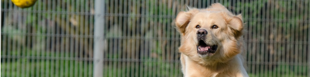
Cuteness aside, I’m aware of the health issues of brachycephalous breeds and I oppose selective inbreeding (line breeding) to meet arbitrary standards. Also: I’m very biased towards retrievers.