
Plotting conditional inference trees
UPDATE - August 2019 - recursive partitioning objects can now be plotted using ggplot2 thanks to {ggparty}, this post is a better option now
Machine learning approaches are becoming popular options for comparative analyses. Random forest (RF) techniques emerged as an extension of classification-tree analysis and are now widespread counterparts to multiple regression. Random forests provide accurate predictions and useful information about the underlying data, even when there are complex interactions between predictors. RF algorithms partition data into groups of increasingly similar observations based on the predictors, and average the results over a forest of many trees built from bootstrapping observations.
When using RF for comparative studies, it is difficult to trace an individual species’ path through a random forest and arrive at the cause of its predicted response. For visualization purposes, several recent papers use single-tree methods. Single-tree methods are generally less accurate and more sensitive to small changes in the data than ensemble methods, but they can display the partitioning of species by predictors visually. Conditional inference trees are one of the most widely used single-tree approaches, they are built by performing a significance test on the independence between predictors and response. Branches are split when the p-value is smaller than a pre-specified nominal level.
Many recent comparative studies of extinction risk (one of my main interests) use conditional inference trees. Even though RF methods can accommodate most types of response variables, most extinction risk studies transform their metrics of extinction risk into a dichotomous response to minimize the effect of the skewed distribution of categorical/ordinal threat values on model accuracy.
| paper | study group | response variable |
|---|---|---|
| Lawes et al. 2015 | Australian rodents | range declines (yes/no) |
| Di Marco et al. 2014 | African land mammals | IUCN threat status (threatened/nonthreatened) |
| Fisher et al. 2013 | Australian marsupials | range declines (yes/no) |
| Murray et al. 2011 | Australian amphibians | population trends (declining/stable) |
The papers in the table all use conditional inference trees to show the relative importance of different predictors and how they interact to put species at risk. My only issue with these papers are the figures for single-tree visualization. All the papers in the table above use the R package party with default plot settings and then add some manual editing, either cosmetic or for journal requirements.
Binary tree objects are fairly simple, and the developers behind the party R package did a good job of making panel-generating functions of class grapcon_generator to plot the trees. That being said, I don’t particularly like the look of the default plots for ctree objects. The ovals for the inner nodes look kind of lame, and the default plots are cluttered with details that aren’t always relevant to what needs to be discussed. The following modifications to the default plotting functions make for better-looking figures, and they should save time plotting and editing binary trees for publication figures or presentation slides (there’s nothing wrong with editing the plots after creating them as long as the underlying tree is reproducible).
In this post I’m simply putting together some code that I found online in discussion threads and then modified following the documentation for the panel generating functions in party.
For a realistic example, I recreated the conditional inference tree in Lawes et al. (2015) using the dataset provided and some guesswork. I only focus on plotting, because the model parameters and accuracy diagnostics for tree-based methods are complicated and will get their own post at some point in the near future.
First, download the supplementary data directly from the journal and change some columns to match the labelling in the paper.
Now we can run the model and plot it with the default settings.
# recursive partitioning
# run ctree model
rodCT <- ctree(declinecategory ~ North.South+Body.mass+Habitat,data = OzRodents,
controls=ctree_control(testtype="Teststatistic"))
# print ctree object
rodCT
# plot tree with default settings
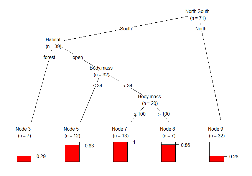
plot(rodCT)The ctree object is itself simple and the tree notation looks like this:
Conditional inference tree with 5 terminal nodes

Response:  declinecategory
Inputs:  North.South, Body.mass, Habitat
Number of observations:  71

1) North.South == {South}; criterion = 18.586, statistic = 18.586
  2) Habitat == {forest}; criterion = 13.216, statistic = 13.216
    3)*  weights = 7
  2) Habitat == {open}
    4) Body.mass <= 34; criterion = 4.523, statistic = 4.523
      5)*  weights = 12
    4) Body.mass > 34
      6) Body.mass <= 100; criterion = 13.915, statistic = 13.915
        7)*  weights = 13
      6) Body.mass > 100
        8)*  weights = 7
1) North.South == {North}
  9)*  weights = 32

The default plot looks like this, and is almost identical to figure 4 in the paper. Plots of binary trees are very self-explanatory, but let’s go through this one. The barplots at the bottom (the terminal nodes) represents the proportion of observations/species that have declined. Region (North/South) seems to be the most important predictor of whether or not rodents declined in range. The first split shows how many more southern rodents have declined in range than northern rodents. The most important variable in the south is habitat structure (node 2). Range decline was much frequent in open habitats than in forests, and all southern rodents of open habitats between 34 g and 100 g have declined in range, with this proportion significantly higher for larger species (nodes 4 and 6).
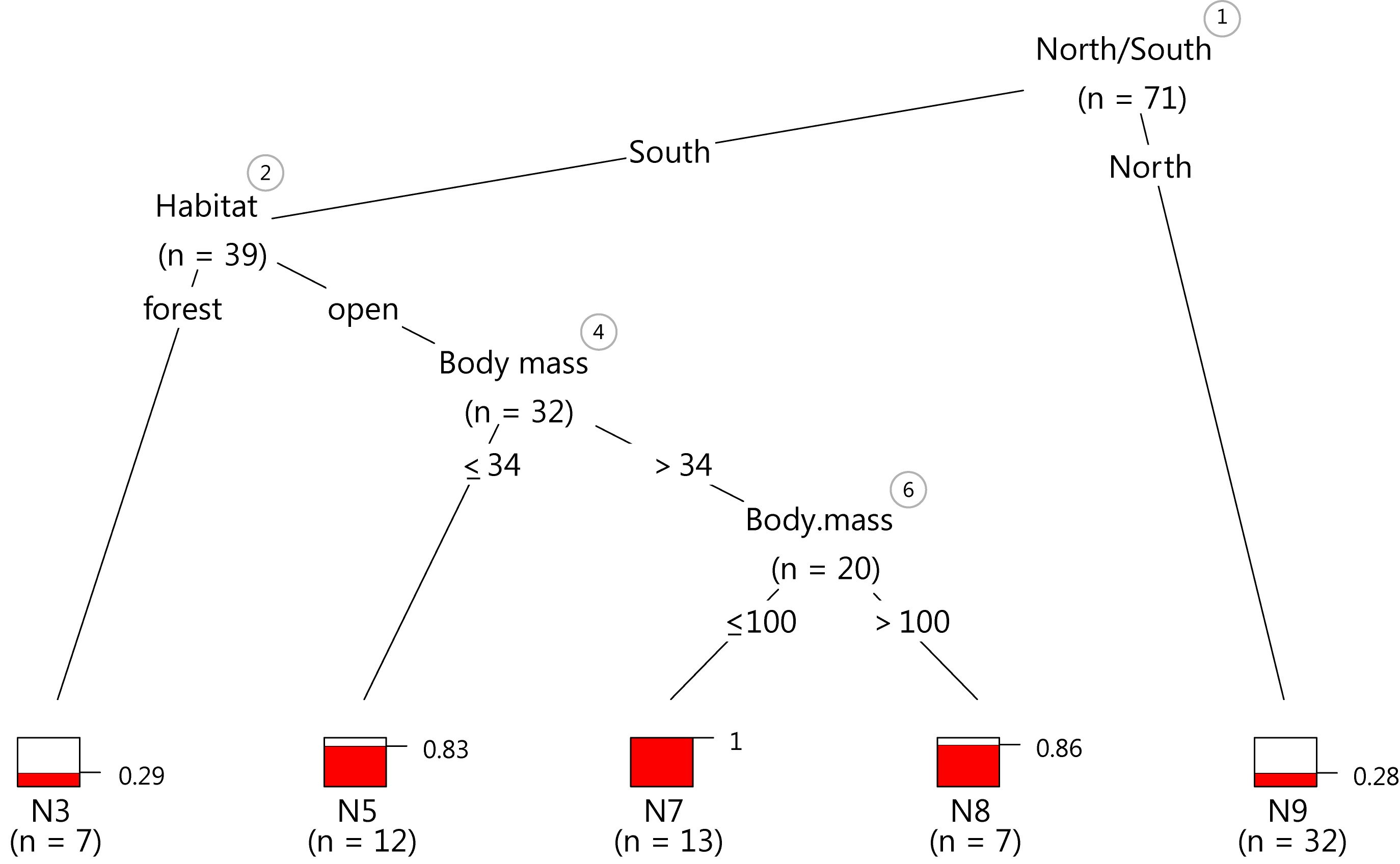
The p-values for the binary splits aren’t discussed in the paper, and for a simple tree the node numbers may be unnecessary. We can remove them along with the ovals around them using the innerWeights function as suggested here. This custom function adds a more informative piece of information to the inner nodes: the number of species at each branching node and not just at the end. The axes for the terminal node barplots look clunky and we can clean up their appearance with a modified node__barplot function as suggested here by Achim Zeileis, one of the masterminds of recursive partitioning. A direct label with the proportion of observations with positive outcomes (species that have declined) looks better and the number of digits can be changed with the digits argument of the grid.yaxis function.
source these two functions:
then plot the ctree object again, the colors can be changed with the fill argument:
plot (rodCT,inner_panel=innerWeights,
      terminal_panel=node_barplot2,
      tp_args = list(ylines = c(2, 4))) # this arg. modifies the spacing between barplots
This plot isn’t too far off from the popular default plot, but the minor differences in the code should save time with editing and improve the data-ink ratio.
Just as a demonstration, I exported the last plot as vector graphics and tinkered with it for five minutes in my 10 year old version of Illustrator CS2. The result looks pretty crisp.
As usual, let me know if there are any mistakes in the code or if anything isn’t well explained.