
ggplot2 visualization of conditional inference trees
This is an update to a post I wrote in 2015 on plotting conditional inference trees for dichotomous response variables using R. I actually used the code from that post to plot a conditional inference tree in this recent publication (see below), but it is now way easier to plot all kinds of tree objects thanks to the new ggparty package by Martin Borkovec and Niyaz Madin. (Thanks to Heidi Seibold for pointing it out on Twitter.)
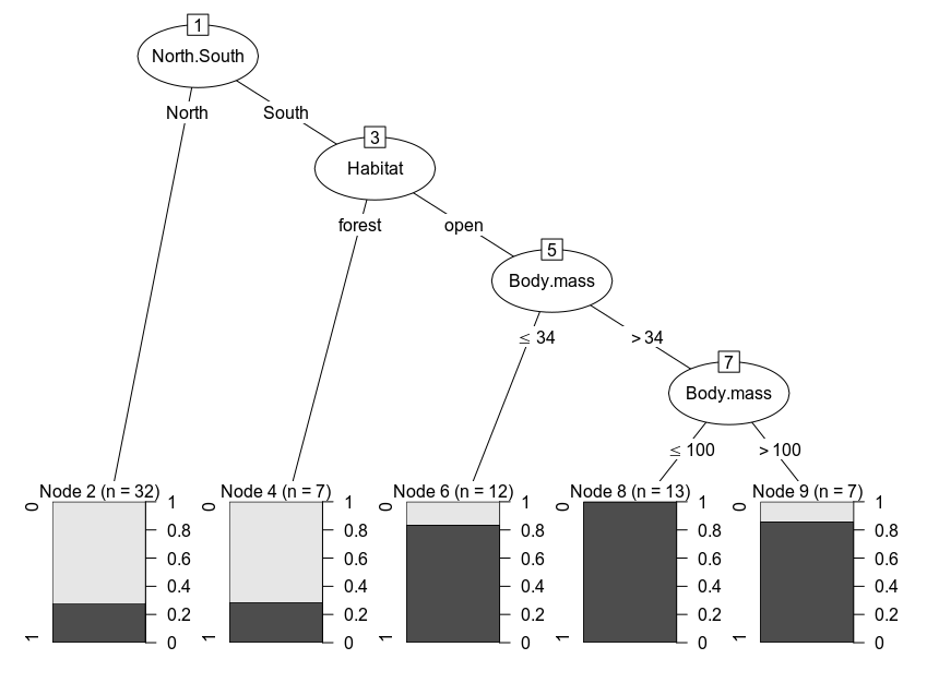
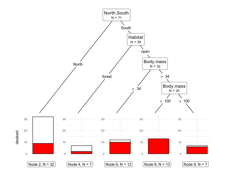
Here, we’ll walk through the code to plot this tree from a publication by Lawes et al. 2015 , in which the figure is the default plot output for an object of class ‘BinaryTree’ produced by party::ctree(). In short, the authors were investigating the factors behind population declines for some species of Australian rodents. See my previous post for a more throrough interpretation of the results and an overview of recursive partitioning methods.
We’ll use the same data and modeling approach, but we’ll plot the tree without having to fiddle with functions of class grapcon_generator and instead use a grammar of graphics approach. Rather than using the ‘party’ package to fit the model, we’ll use ‘partykit’ (a reimplementation by the same team) and get the same result but in an object of class ‘party’ that feeds into ggparty.
Part of the makeover will show how flexible this approach is, and how those familiar with ggplot2 should have no trouble applying their experience to these types of plots.
As in the previous post, we’ll enhance the interpretation of the default plot by:
-
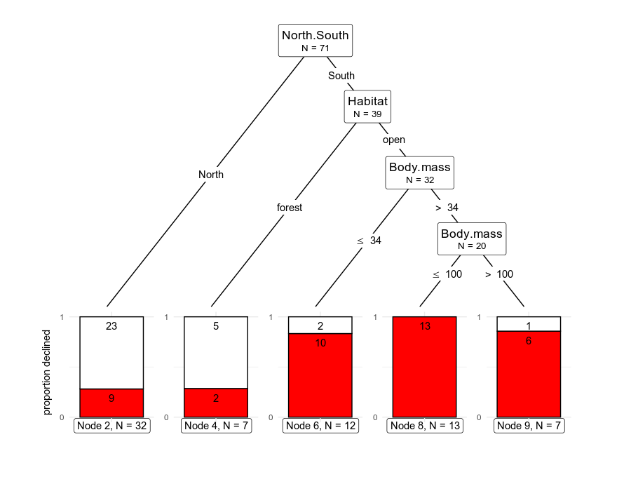
adding a more informative piece of information to the inner nodes: the number of species at each branching node and not just at the terminal nodes.
-
adding direct labels to the terminal plots with the number of observations with positive outcomes (species that have declined)
The ggparty vignette is quite clear and has lots of examples, so I was able to customize all the elements I needed. The main point to keep in mind is that ggplot() is called repeatedly for each of the terminal nodes, so we need to use “,” instead of “+” to combine the components of the list with geoms and other plotting parameters.
First, we load the relevant packages, download the supporting data directly from the journal’s repository, and change some columns to match the labeling in the paper.
# packages
library(partykit)
library(dplyr)
library(readxl)
library(ggparty)


# Download the data directly from the journal
xlfileURL <- "http://files.figshare.com/2149369/S1_File.xlsx"
# download the excel file as a binary file
download.file(xlfileURL, destfile = "rodentData.xlsx")
# read the first and only sheet in the file
OzRodents <- read_excel("rodentData.xlsx", sheet = 1)

# rename the relevant columns
OzRodents <- OzRodents %>% rename(
  North.South = NS,
  Body.mass = fmass,
  Habitat = habopenness
)
# manipulate the data to match the labels in the figure
# change decline category into a binary outcome
OzRodents <- OzRodents %>%
  mutate(declinecategory = ifelse(declinecategory != "none", 1, 0))
OzRodents$declinecategory <- as.factor(OzRodents$declinecategory)
# change NorthSouth into factor
OzRodents <- OzRodents %>%
  mutate(North.South = ifelse(North.South != 1, "South", "North"))
OzRodents$North.South <- as.factor(OzRodents$North.South)
# change Habitat.openness into open vs. forest (based on the data and as described in the methods section)
OzRodents <- OzRodents %>%
  mutate(Habitat = ifelse(Habitat > 2, "forest", "open"))
OzRodents$Habitat <- as.factor(OzRodents$Habitat)
We can now fit the model
# recursive partitioning
# run ctree model
rodCT <- partykit::ctree(declinecategory ~ North.South + Body.mass + Habitat,
  data = OzRodents,
  control = ctree_control(testtype = "Teststatistic")
)

plot(rodCT)
The plotting code looks convoluted but we just need to draw edges and nodes, with lists of arguments to modify their appearance.
# plotting
ggparty(rodCT) +
  geom_edge() +
  geom_edge_label() +
  geom_node_label(
    line_list = list(
      aes(label = splitvar),
      aes(label = paste("N =", nodesize))
    ),
    line_gpar = list(
      list(size = 13),
      list(size = 10)
    ),
    ids = "inner"
  ) +
  geom_node_label(aes(label = paste0("Node ", id, ", N = ", nodesize)),
    ids = "terminal", nudge_y = -0.3, nudge_x = 0.01
  ) +
  geom_node_plot(
    gglist = list(
      geom_bar(aes(x = "", fill = declinecategory),
        position = position_fill(), color = "black"
      ),
      theme_minimal(),
      scale_fill_manual(values = c("white", "red"), guide = FALSE),
      scale_y_continuous(breaks = c(0, 1)),
      xlab(""), ylab("proportion declined"),
      geom_text(aes(
        x = "", group = declinecategory,
        label = stat(count)
      ),
      stat = "count", position = position_fill(), vjust = 1.7
      )
    ),
    shared_axis_labels = TRUE
  )
The plot looks good already, and in my opinion it shows good balance between a graphical depiction of how the observations are split, with explicit data on the numbers of observations at the nodes and the relevant values in the predictors that define the splits.
We could also do away with the “position_fill()” argument and show the absolute numbers of observations at each terminal node.
# plotting
ggparty(rodCT) +
  geom_edge() +
  geom_edge_label() +
  geom_node_label(
    line_list = list(
      aes(label = splitvar),
      aes(label = paste("N =", nodesize))
    ),
    line_gpar = list(
      list(size = 13),
      list(size = 10)
    ),
    ids = "inner"
  ) +
  geom_node_label(aes(label = paste0("Node ", id, ", N = ", nodesize)),
                  ids = "terminal", nudge_y = -0.35, nudge_x = 0.01
  ) +
  geom_node_plot(
    gglist = list(
      geom_bar(aes(x = "", fill = declinecategory),
               color = "black"
      ),
      theme_minimal(),
      scale_fill_manual(values = c("white", "red"), guide = FALSE),
      xlab(""), ylab("declined")
         ),
    shared_axis_labels = TRUE
  )
As usual, let me know if there are any mistakes in the code or if anything isn’t well explained. Big shout out to the creators of ggparty!