
Get top values by group (animated)
Thanks to the ‘gganimate’ package, expository demos are in season:
Me too! Didn’t see that coming
— Thomas Lin Pedersen (@thomasp85) August 15, 2018
For previous posts, I’ve made graphical summaries of R functions such as this one below.
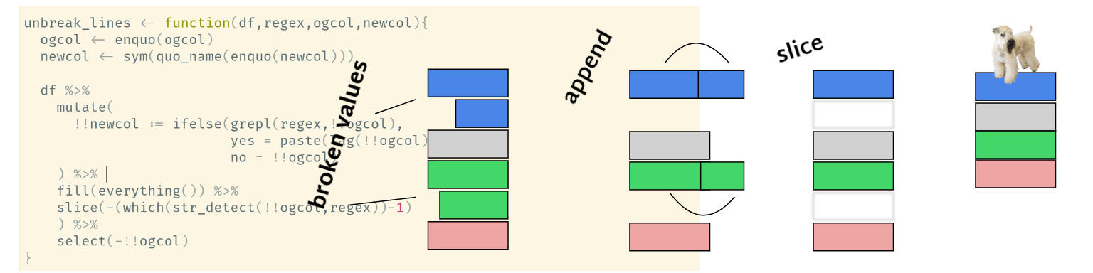
Now that I know how to make crude animations of the data-wrangling process, I made this animation of various tidyerse functions piped together. I focused on the top_n() function in ‘dplyr’ because I’ve written about it in the past and the posts still seem to get pretty regular traffic (links below).
top_n() posts:
English version
Spanish version
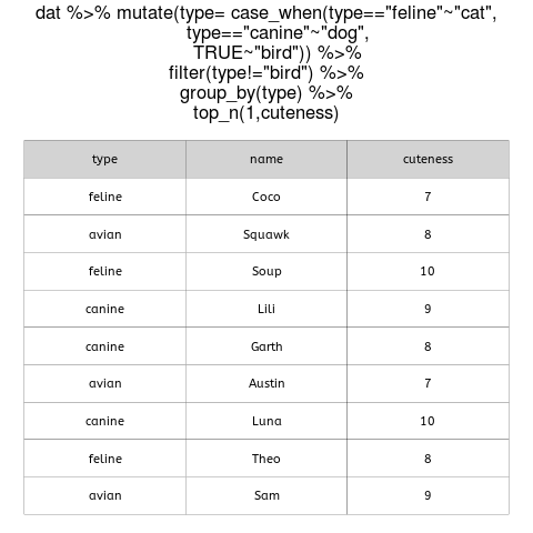
Say we have a dataset with three dogs, three cats, and three birds. We have names for each one, plus their ‘cuteness’ rating as a continuous value. The code to create the animation is in the gist at the end of this post (full of hacks but reproducible).
I pasted the code as the plot title, but we can interpret each step like so:
- Mutate to modify character strings, using multiple conditional statements.
- Filter to discard birds.
- Group by the type of animal.
- Get the top value for each group.
These are Luna and Lili, respectively.

peace!
the code: