
Here is some code and a few recommendations for creating spatially-explicit plots using R and the ggplot and sf packages.
Lets suppose that we want to plot country outlines and occurrence points for two species of animals. Without having to download Shapefiles or import spreadsheets, we can use data bundled with or imported by rnaturalearth (a package from the rOpenSci crew that interacts with Natural Earth, a public domain spatial dataset). We’ll be generating random points to represent point occurrence data for the two species of animals.
We’ll work with Senegal for this post. We can assign an sf (simple features) object for all of Africa, and then filter it by country name. After that, random points for our two hypothetical species can be generated within the Senegal polygon using st_sample.
# load libraries (install first if needed)
library(rnaturalearth)
library(sf)
library(dplyr)
library(purrr)
library(ggplot2)
library(pointdensityP)

# map of Africa
Africa <- ne_countries(continent = "Africa", returnclass = "sf", scale = "medium")
# filter by country name
Senegal <- Africa %>% filter(sovereignt=="Senegal")

# random points
spA <- st_sample(Senegal,189) %>% st_sf() %>% mutate(sp="spA")
spB <- st_sample(Senegal,103) %>% st_sf() %>% mutate(sp="spB")
pts <- rbind(spA,spB)
We can already plot these two objects with ggplot. The map looks OK, and we haven’t even tweaked any of the plot arguments.
# plot
plain <-
  ggplot()+
  geom_sf(data=Senegal)+
  geom_sf(data=pts,aes(shape=sp,color=sp))+
  theme_bw()
plain
# write to disk (optional)
#ggsave(plain,filename = "01_bfr_e.png",width = 6, height = 5,units = "in", dpi=300,device = "png")
If we change the point size for visibility and make them larger, some will surely overlap and we might overlook them. To solve this clutter, I took Simon Jackson’s advice from this post of setting the point transparency in relation with local point density (inversely proportional). If there are lots of overlapping points, they are more transparent, while spatially isolated points remain opaque.
To accomplish this, we need the coordinates from the sf object (they are held in a list-column). Then we estimate the spatial point density using the pointdensityP package. I went with a pretty narrow grid size and search radius here. We then join the densities with our sf point object and scale the values between 0 and 1.
# densities
ptsMat <- st_coordinates(pts)
ptdens <- pointdensity(ptsMat,lat_col = "Y",
                       lon_col = "X", grid_size = 2,radius = 8)
ptsmerged <- bind_cols(pts,data.frame(ptsMat)) %>% left_join(ptdens,by=c("X"="lon","Y"="lat")) %>%
  rename(ptdensities=count) %>%
  mutate(ptdensitiesSc=scales::rescale(ptdensities,c(0.01,1)))
be aware that the pointdensity function arranges the output table by density, so we need to merge or join this with our sf object. If we simply bind the columns we lose all sense of the actual densities for each point (I learned that the hard way).
We can also improve our map by adding some geographic context. Plotting the neighboring countries can add this useful context. The st_touches functions tells us which features share boundaries with our target object, Senegal. This way, we can assign a new object with the neighbors by slicing the one we had for all of Africa.
# context
adjSen <- st_touches(Senegal,Africa)
neighbours <- Africa %>% slice(pluck(adjSen,1))
limsSen <- st_buffer(Senegal,dist = 0.5) %>% st_bbox()
Lastly, we can customize the shapes, colors, borders, fills, and transparency values. I often use the st_bbox and st_buffer functions to set the plot limits (fed into coord_sf) and focus the plot on our target feature. A few other arguments can help us hide the gridlines and add informative titles to the plot and to the legend. The final result looks pretty crisp.
crisp <-
  ggplot()+
  geom_sf(data = neighbours)+
  geom_sf(data=Senegal,fill="white")+
  geom_sf(data=ptsmerged,aes(shape=sp,fill=sp,size=3,alpha=1/ptdensitiesSc),color="black")+
  scale_shape_manual(values = c(21,24),guide=FALSE)+
  scale_fill_manual(values = c("#ff8c42","#320d6d"),name="Species")+
  scale_alpha_continuous(range = c(.6, 1),guide=FALSE)+
  scale_size_identity(guide = FALSE)+
  coord_sf(xlim = c(limsSen["xmin"], limsSen["xmax"]),
           ylim = c(limsSen["ymin"], limsSen["ymax"]),
  )+
  labs(title="Species occurrence in Senegal")+
  theme(plot.background = element_rect(color = "black",size=0.5)) +
  theme(panel.background = element_rect(fill = "#D3E0F8", color = "#D3E0F8"))+
  theme(
    panel.grid = element_line(colour = 'transparent'),
    line = element_blank(),
    rect = element_blank())
crisp
# export, optional
#ggsave(crisp,filename = "02_aftr_e.png",width = 6, height = 5,units = "in", dpi=300,device = "png")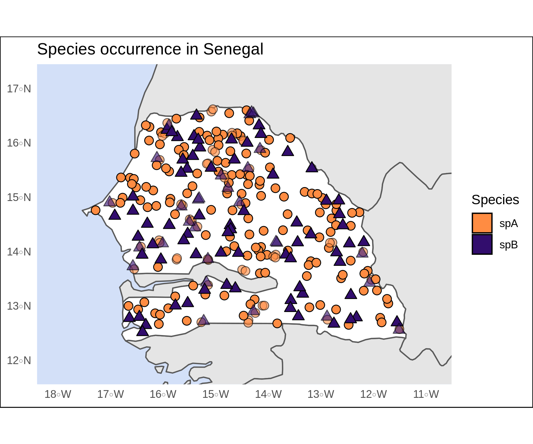
To compare the two figures, this sequence of piped functions show how well purrr, fs, and magick work to read the image files for our plots and create a .gif animation with the two.
# animate
library(magick)
library(fs)
# png files in the working directory
dir_ls(glob = "*.png") %>% map(image_read) %>%
  image_join() %>% image_morph(frames = 20) %>%
  image_animate(fps = 5) %>%
  image_write("mapas_e.gif")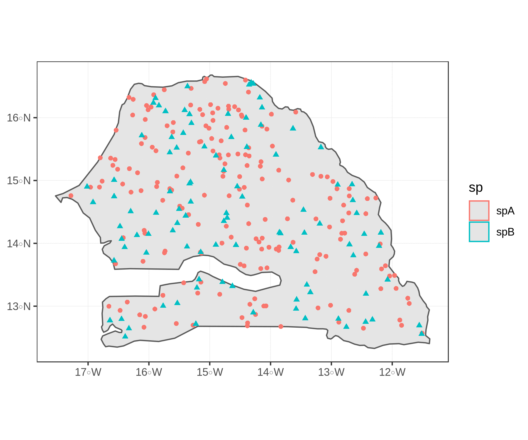
Pretty cool! Feel free to contact me with feedback or questions :)