

Comparing dog and cat ratings
Here is yet another post about dogs and the @dog_rates Twitter account. I’m writing this as a way to try out the rtweet package (and to document some plotting code that I had to leave out of an unrelated paper).
In this post, I’ll compare scores for two independent samples, represented here by ratings for around 200 dogs and 200 cats, sourced from two popular Twitter accounts that share user-provided photos with funny captions and a rating out of 10 for a different dog or cat. Cat ratings come from the We Rate Cats account, which has a big following, a good number of posts, and variation in the ratings for the various cats.
Here are some examples:
Meet Frida. She's in the search & rescue division of the Mexican Navy along with two German shepherds. Sadly, she's been busy lately. 14/10 pic.twitter.com/82nlfkvodW
— SpookyWeRateDogs™ (@dog_rates) September 20, 2017
Elsie is always hungry & waiting for food. 12/10 for being a lil fatty pic.twitter.com/KFIMhlblU1
— We Rate Cats 🐈 (@CatsRates) September 30, 2017
These are the main steps in the workflow:
- Get the tweets
- Extract the ratings
- Plot the data
- Test for differences
Downloading the tweets was super easy thanks to rtweet. Once you setup your app and authentication keys with this handy guide, you should be able to reproduce everything in this post.
# load libraries (install first if needed)
library(rtweet)
library(dplyr)
library(stringr)
# api auth setup
## name assigned to created app
appname <- "for rtweet"
## api key (use your own)
key <- "your key goes here"
## api secret
secret <- "your secret key goes here"
## authorization
twitter_token <- create_token(
  app = appname,
  consumer_key = key,
  consumer_secret = secret)

## retrieve the tweets
# cat_rates tweets
cat_tweets <-  get_timeline("CatsRates", n = 500)
# dog_rates tweets
dog_tweets <- get_timeline("dog_rates", n= 1700)
First, we download the tweets and clean up the resulting data frames. I specified different numbers of tweets to retrieve because the @dog_rates account is more active in retweeting and replying, and we only want ratings.
After stripping replies and retweets, some minor data wrangling will get us to a more or less even sample for each screen name. I used str_detect() to only keep rows with tweet text that contained a rating (e.g. the string “/10”).
# remove RTs and replies
cat_tweetsT <- cat_tweets %>% filter(is_retweet==FALSE & is.na(in_reply_to_status_user_id))
dog_tweetsT <- dog_tweets %>% filter(is_retweet==FALSE & is.na(in_reply_to_status_user_id))

# bind tweet df
alltweets <- bind_rows(cat_tweetsT,dog_tweetsT)

# drop some (most columns)
alltweets <- alltweets %>% select(screen_name, text, retweet_count, favorite_count, created_at)

# Remove tweets without scores out of 10
alltweets <- alltweets %>% filter(str_detect(text, "/10"))

# how many of each
alltweets %>% count(screen_name)
To extract the ratings into a new column, we can use stringr again with some hacky regex to pull out digits preceding the string /10 (positive lookahead). After converting the column to numeric, this data is ready for visualization.
# new var with rating
alltweets$rate <-  str_extract(alltweets$text,pattern =  "\\d+(?=\\/10)")
# change data type
alltweets$rate <- as.numeric(alltweets$rate)
# filter NA and outliers
alltweets <- alltweets %>% filter(!is.na(rate) & rate < 99 & rate > 6)

#summary
alltweets %>% group_by(screen_name) %>% summarise(meanRating=mean(rate), n=n()) %>% ungroup()
To show the difference in ratings, I used a sina plot, implemented in the ggforce package. It is like a strip chart but with the points jittered according to their local density. I feel that this type of plot shows the distribution of the points well. Most dogs received a 13/10, while cats got mainly 12/10 with more variation around this value.
# plotting libraries
library(ggplot2)
library(hrbrthemes)
library(ggforce)
library(ggalt)

# plot ratings
ggplot(alltweets)+
  geom_sina(aes(y=rate, x=screen_name, fill=screen_name),color="black", pch=21)+
  scale_fill_manual(values = c("#335EAD", "#EEBB33"))+ylab("rating")+
  theme_ipsum_rc(grid = "y", base_size = 12,axis_title_size = 12)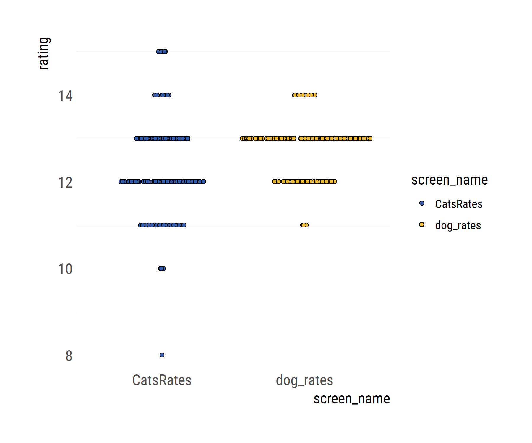
We might typically use a two-sample t-test to compare the means of the two groups. This is assuming that both samples are random, independent, and come from normally distributed population with unknown but equal variances. However, the t-test has some problems. By assuming equal variances and normally distributed data, any F tests are sensitive to outliers and not that easy to interpret, because the best-fitting normal distributions do not describe the data well.
Rather than testing whether two groups are different, we could aim to estimate how different they are, which is more informative. To do this, we can use a Bayesian approach: BEST (Bayesian estimation supersedes the t-test), proposed by John K. Kruschke. We’ll use the R package BEST for this.
BEST estimates the difference in means between two groups (expressed as the mean differences of the marginal posterior distributions) and provides a probability distribution over the difference. From this distribution of credible values we consider the mean value as our best guess of the actual difference and a Highest Density Interval (HDI) as the range where the actual difference is, with X% credibility (e.g. 95 or 99%). If the HDI does not include zero, then zero is not a credible value for the difference of means between groups.
Although I didn’t go into it, BEST also provides complete distributions of credible values for the effect size, standard deviations and their difference, and the normality of the data. Read more about BEST here, here, and in this puppy-themed book by J.K. Kruschke himself.
# separate vectors for t tests
dogratesVec <- alltweets %>% filter(screen_name=="dog_rates") %>% pull(rate)
catratesVec <- alltweets %>% filter(screen_name!="dog_rates") %>% pull(rate)
library(BEST)
# run model
Bestdogscats <- BESTmcmc(dogratesVec, catratesVec)
Bestdogscats # default reporting
# for reporting results
round(summary(Bestdogscats, credmass=0.99),3)
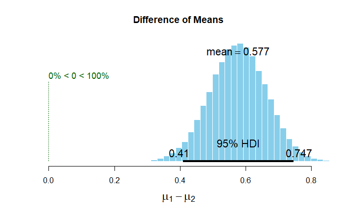
# plot the difference of means
plot(Bestdogscats)Setting up and running the model (with default settings and arguments) is pretty straightforward, and once it’s done we can look at the model summary. Basically, the difference of means being different from cero is a credible value given the data.
            mean median   mode HDI%  HDIlo  HDIup
mu1       12.790 12.790 12.788   95 12.709 12.874
mu2       12.213 12.213 12.217   95 12.066 12.357
muDiff     0.577  0.577  0.583   95  0.410  0.747
Let’s look at it graphically. BEST has a built in plotting function that generates this figure.
Because I get uncomfortable when I can’t change things in ggplot, the following code reuses values and elements from the output and summary of the BEST model to recode a similar plot, using a density plot instead of a histogram.
# recreating the figure with ggplot
# save summary objects
summBEST <- summary(Bestdogscats,credMass = 0.99) %>% as.data.frame()
# save plot objects
dogcatDiffs <- plot(Bestdogscats,credMass = 0.99)
# make plot objects into DFs
dogcatsDiffsDF <- data.frame(counts=dogcatDiffs$counts,
                          dens=dogcatDiffs$density,
                          mids=dogcatDiffs$mids)
# new df with the difference of means (post. distributions)
muDiff <- data_frame(meandiff=Bestdogscats$mu1 - Bestdogscats$mu2)

# plot
ggplot(dogcatsDiffsDF)+geom_bkde(data=muDiff, aes(x=meandiff),fill="#335EAD",color="gray")+
  geom_segment(aes(x = summBEST["muDiff","HDIlo"],
                   y = 0, xend = summBEST["muDiff","HDIup"],
                   yend = 0),size=2.5)+
  xlab(expression(mu[1] - mu[2]))+ylab("density")+
  geom_segment(aes(x=0,y=0,xend=0,yend=max(dogcatsDiffsDF$dens)*.89),linetype=2)+
  annotate("text",x=0,y=max(dogcatsDiffsDF$dens)*.93,label="0")+
  theme_ipsum_rc(grid="y", base_size = 12,axis_title_size = 14)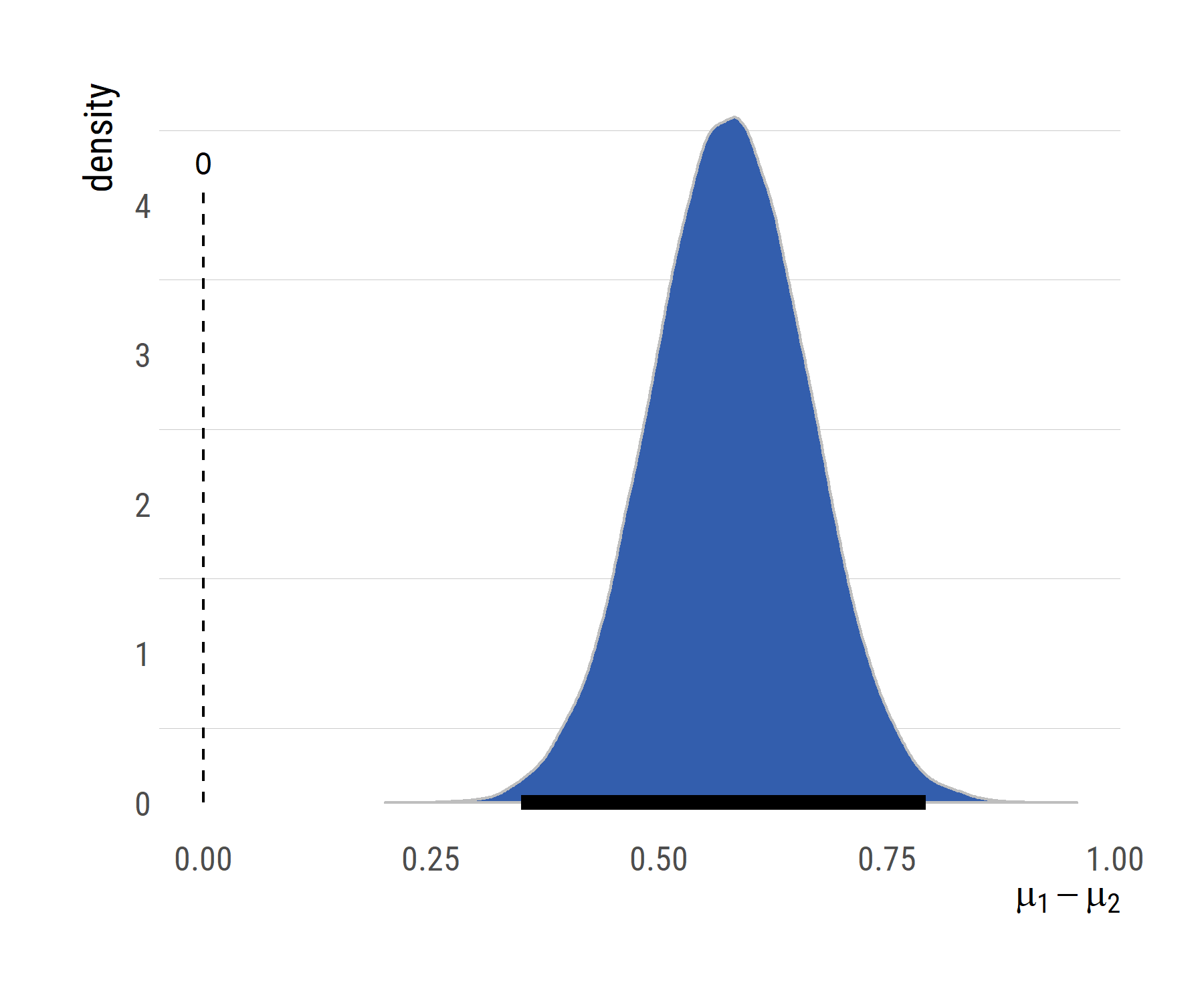
Now we know that the mean rating differs between dogs and cats. I’m a dog person so you can probably guess how I would interpret this result. I’m happy to get any feedback on this.
Update: After sharing this post, Maëlle Salmon asked if maybe the ratings relate to the number of likes and retweets that a dog/cat is getting. Because the variables are right there in the data frame, I’ve added some code for a quick plot of retweets/likes ~ ratings. I logged the response variables, just because.
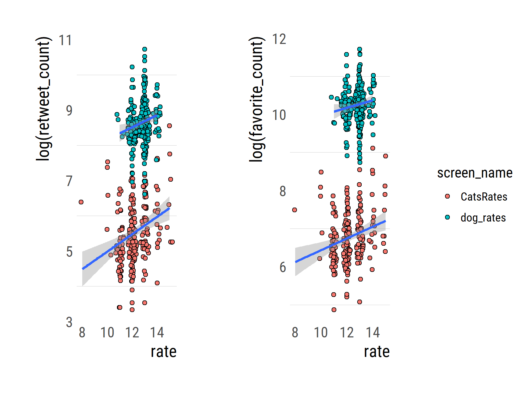
We can even calculate the correlations, which turn out to be quite weak.
# plot retweets
rtplot <-
ggplot(alltweets,aes(x=rate, y=log(retweet_count)))+geom_sina(aes(fill=screen_name), pch=21)+
  geom_smooth(aes(group=screen_name),method = "lm", se = TRUE)+
  theme_ipsum_rc(grid="y", base_size = 12,axis_title_size = 14)
# plot likes
favplot <- ggplot(alltweets,aes(x=rate, y=log(favorite_count)))+geom_sina(aes(fill=screen_name), pch=21)+
  geom_smooth(aes(group=screen_name),method = "lm", se = TRUE)+
  theme_ipsum_rc(grid="y", base_size = 12,axis_title_size = 14)

library(cowplot)
# arrange the plots side by side
rtfavs <- plot_grid(rtplot + theme(legend.position="none"),favplot+ theme(legend.position="none"), nrow = 1)
# for shared legend
legendrtfav <- get_legend(rtplot)

# add the legend to the row we made earlier. Give it one-third of the width
# of one plot (via rel_widths).
p <-  plot_grid(rtfavs, legendrtfav, rel_widths = c(3, .3))
p

# correlation
alltweets %>% group_by(screen_name) %>% summarize(corFavs = cor(favorite_count,rate),
                                                  corRTs  = cor(retweet_count,rate))