
This post from 2019 describes an approach for making Structure-style plots for model-based clusters of population genetic structure using ggplot2. The code still runs fine, but a) the post was unrealistic and used made-up data that looks odd given the lack of structure and b) we can improve on the plots using new ggplot extensions. (I also wrote the post before learning to use the tidyr::pivot_ functions)
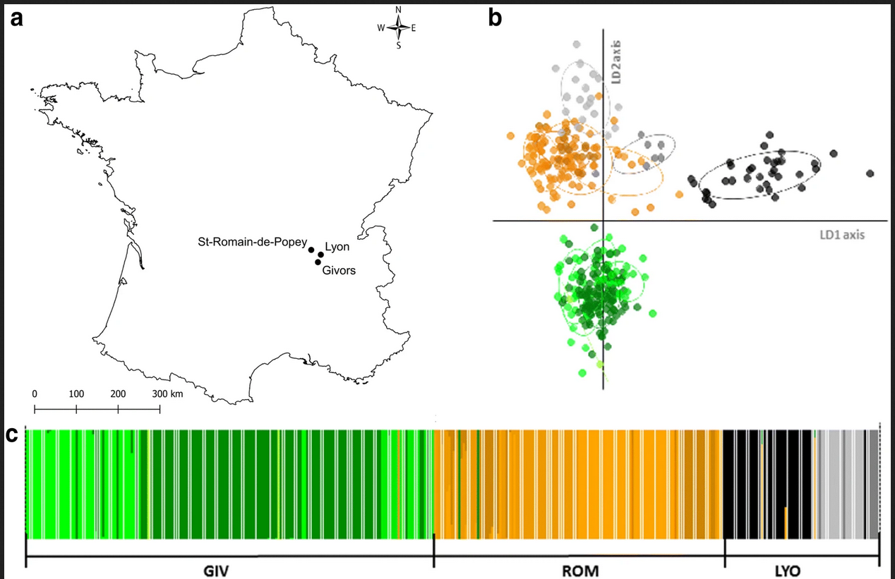
Here I’ll recreate a Discriminant Analysis on Principal Components (DAPC) from this (Open Access) publication by Amélie Desvars-Larrive et al. from 2019. The authors used microsatellites to examine the genetic structure of brown rat populations in Eastern France, and ran DAPC in R using the adegenet pacakge. This is a really cool paper with a very large sample that also examined resistance to rodenticides.
Figure 1 in the publication shows the study sites, the genetic structure in discriminant space, and the cluster assignment in panel C. We’ll focus on panel C.
Let’s repeat the analysis but then use ggplot to show the individual membership assignment of the sampled animals to the genetic clusters identified by DAPC. The underlying data was shared in an xlsx file here, which we can work with once we have it in our working directory.
Setup
To get going, we need to load a few package and import the allele data (sources and versions added with annotater).
# Load libraries. Install first if needeed
library(readxl)    # CRAN v1.3.1
library(janitor)   # CRAN v2.1.0
library(dplyr)     # CRAN v1.0.7
library(tidyr)     # CRAN v1.1.3
library(adegenet)  # CRAN v2.1.4
library(ggplot2)   # CRAN v3.3.5
library(forcats)   # CRAN v0.5.1
library(stringr)   # CRAN v1.4.0
library(ggh4x)     # [github::teunbrand/ggh4x] v0.2.0.9000
library(paletteer) # CRAN v1.4.0
library(extrafont) # CRAN v0.17

# Read microsatellite data from spreadsheet
rats <- read_excel("10340_2018_1043_MOESM1_ESM.xlsx") %>% clean_names()
Preparing the data
At this point, there’s a few easy steps to prepare the allele data for the df2genind() function that converts this input to a genind object. I used sprintf to pad the repeats so that the ncode argument works (ncode is an optional integer giving the number of characters used for coding one genotype at one locus).
# subset the individual IDs and the loci data and coerce to data.frame
rat_microsdf <- rats %>%
  select(rat_id, d19r62:d3r159) %>%
  as.data.frame()
row.names(rat_microsdf) <- rat_microsdf$rat_id
rat_microsdf$rat_id <- NULL

# pad the repeats
rat_microsdf <- rat_microsdf %>% mutate(across(everything(), ~ sprintf("%06d", .x)))

# create genind object
ratgen <- df2genind(rat_microsdf, ncode = 6)
ratgen
The converted object now prints this:
> ratgen
/// GENIND OBJECT /////////

 // 355 individuals; 13 loci; 425 alleles; size: 678.2 Kb

 // Basic content
   @tab:  355 x 425 matrix of allele counts
   @loc.n.all: number of alleles per locus (range: 14-73)
   @loc.fac: locus factor for the 425 columns of @tab
   @all.names: list of allele names for each locus
   @ploidy: ploidy of each individual  (range: 2-2)
   @type:  codom
   @call: df2genind(X = rat_microsdf, ncode = 6)

 // Optional content
- empty -
Run DAPC
With the data in genind format, we can run find.clusters and then dapc with the newly identified clusters. For the Structure-style plot, we need the membership probabilities of each individual for each cluster. We pull these from the dapc result, pivot these to long format, and add labels. Then we’ll be ready for plotting.
# find clusters
grp <- find.clusters(ratgen, max.n.clust = 20) # 180 PCS, 7 clusters
# Discriminant analysis using the groups identified by find.clusters
rats_dapc <- dapc(ratgen, grp$grp) # 160 PCs, 6 DFs
# create an object with membership probabilities
postprobs <- as.data.frame(round(rats_dapc$posterior, 4))
# put probabilities in a tibble with IDS and labels for sites
ratclusters <- tibble::rownames_to_column(postprobs, var = "ind") %>%
  mutate(trapsite = rats$site)

# melt into long format
rats_long <- ratclusters %>% pivot_longer(2:8, names_to = "cluster", values_to = "prob")

# manual relevel of the sampling sites (to avoid alphabetical ordering)
rats_long$trapfact <- fct_relevel(as.factor(rats_long$trapsite), "GIV1", "GIV2", "GIV3", "GIV4", "GIV5", "GIV6", "ROM1", "ROM2", "ROM3", "ROM4", "ROM5", "ROM6", "LYO1", "LYO2", "LYO3", "LYO4", "LYO5")
# column for the municipality abbreviation
rats_long <- rats_long %>% mutate(loc = str_remove(trapsite, "[0-9]"))
For clarity, this is what the probabilites look like raw:
> head(postprobs)
        1 2 3 4 5 6 7
GIV0158 0 0 0 0 0 0 1
GIV0159 0 0 0 0 0 0 1
GIV0160 0 0 0 0 0 0 1
GIV0161 0 0 0 0 0 0 1
GIV0162 0 0 0 0 0 0 1
GIV0163 0 0 0 0 0 0 1
Then the long-format probabilities with labels for plotting and faceting look like this:
> head(rats_long)
# A tibble: 6 × 6
  ind     trapsite cluster  prob trapfact loc
  <chr>   <chr>    <chr>   <dbl> <fct>    <chr>
1 GIV0158 GIV2     1           0 GIV2     GIV
2 GIV0158 GIV2     2           0 GIV2     GIV
3 GIV0158 GIV2     3           0 GIV2     GIV
4 GIV0158 GIV2     4           0 GIV2     GIV
5 GIV0158 GIV2     5           0 GIV2     GIV
6 GIV0158 GIV2     6           0 GIV2     GIV
Plotting
facet_nested from the ggh4x package lets us implement nested facets to show sampling sites in their respective municipalities. Before calling ggplot, we need to set up some customization parameters for the nested facets via strip_nested. This lets us toggle the font size for each strip layer, and lets us turn off clipping for the strip text for those locations with few samples (and consequently, narrow facets). I was unaware of ggh4x, but the package comes with lots of cool utility functions for ggplot and has a great hex logo.
 # set up custom facet strips
facetstrips <- strip_nested(
  text_x = elem_list_text(size = c(12, 4)),
  by_layer_x = TRUE, clip = "off"
)
Onto the ggplot call. The suitable geom here is geom_col because we want the bars to add up to 1. This way we are in control of the spacing of different locations by using facets, the expand argument for the scales, and the panel.spacing argument for the overall plot theme. Note how the scales and space arguments to facet_nested help us accommodate the different number of individuals per location. switch places the facet labels below the plot.
ggplot(rats_long, aes(factor(ind), prob, fill = factor(cluster))) +
  geom_col(color = "gray", size = 0.01) +
  facet_nested(~ loc + trapfact,
    switch = "x",
    nest_line = element_line(size = 1, lineend = "round"),
    scales = "free", space = "free", strip = facetstrips,
  ) +
  theme_minimal(base_family = "Nimbus Sans") +
  labs(x = "Individuals", y = "membership probability") +
  scale_y_continuous(expand = c(0, 0)) +
  scale_x_discrete(expand = expansion(add = 0.5)) +
  scale_fill_paletteer_d("ghibli::PonyoMedium", guide = "none") +
  theme(
    panel.spacing.x = unit(0.18, "lines"),
    axis.text.x = element_blank(),
    panel.grid = element_blank()
  )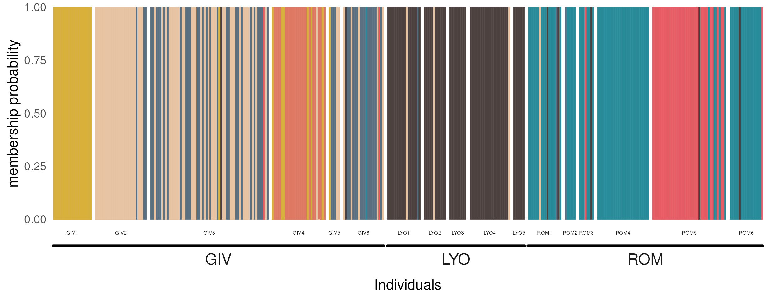
Individuals are represented by vertical bars, colors correspond to different genetic clusters, and each individual’s color proportion indicates its membership to the corresponding cluster. Individuals are faceted by sampling location and a thicker line groups these locations. Compare this plot with the output of dapc::compoplot:
compoplot(rats_dapc, col = funky, xlab = "individuals")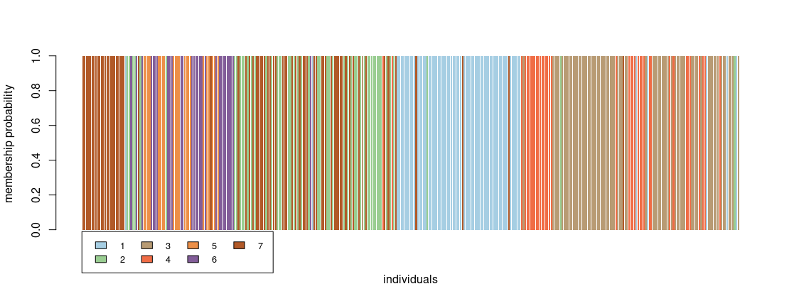
The final result looks pretty good and those interested in population genetics can now see the structure and migration. This code will work with any number of clusters (K values) as long as the data are in long format. Try this with your own data and let me know if it works. Special thanks to conservation genomics specialist Lilly D. Parker for answering all my microsatellite questions :)