

Animate shot distances for NBA games
Earlier this week I was asked to post the code for the animation in this tweet, which shows the distance for shots taken throughout a basketball game by two players. I wanted to check out the CRAN version of gganimate by Thomas Lin Pedersen, and was also meaning to explore NBA data for a while. I reasoned this might be an interesting way to show offensive activity.
playing with #gganimate and #nbastatr to visualize shooting distances during that exciting 76ers vs Hornets match-up back in November
— Luis D. Verde (@LuisDVerde) January 4, 2019
🏀#rstats pic.twitter.com/RbQYA8SzkD
Animating the ggplot2 objects
The ‘shot chart detail’ data from the NBA stats API was accessed with nbastatr by Alex Bresler. The shot chart data is already tidy and almost ready for use. Shot distances come in their own variable, and the time when each shot was taken appears in three columns: quarter, minutes remaining, and seconds remaining. This can all be converted to chronological time using dplyr and lubridate. After that everything is pretty straightforward if we’re familiar with the basic grammar of ggplot and gganimate (i.e. facets, geoms, and annotations).
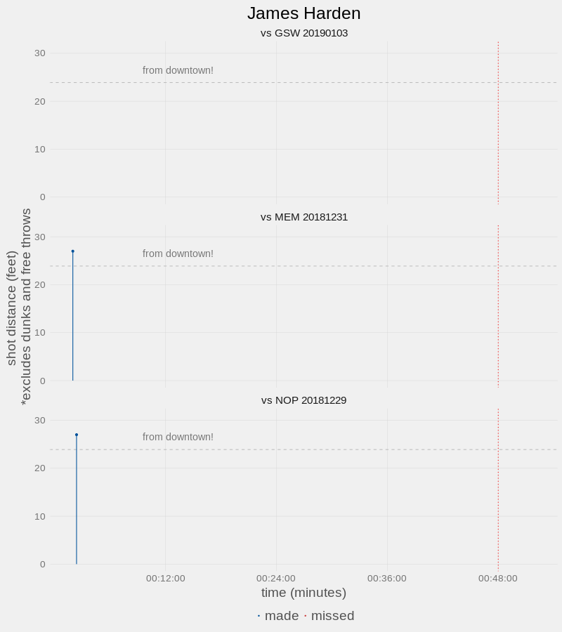
Here are the shot distances for James Harden’s last three games:
the code:
Hope you found this helpful and/or interesting!