

Waffle charts with svg images
Earlier this month I saw a couple of waffle charts on Twitter used as a nice alternative to showing counts and proportions with bar graphs.
Bar charts are easy and precise. But they're boring as hell. If you need your chart to stand out, that's bad.
— Albert Rapp (@rappa753) September 6, 2022
Waffle charts can be an eye-catching alternative. Especially, if you use icons. Use waffle charts to show counts or parts of a whole.
Here's how you build them. #rstats pic.twitter.com/RqhaxTeOLy
#TidyTuesday week 36 Lego Bricks, data from https://t.co/1l8zxz3rpU, courtesy of @geokaramanis.
— Lee Olney (@leeolney3) September 6, 2022
Waffle plot inspired by @issa_madjid #rstats code: https://t.co/7TLlBIL2gu pic.twitter.com/N6SazCysof
##
Coincidentally, I had struggled with this a few months back for some freelance work and was meaning to document this alternative approach that uses ggsvg to draw svg (Scalable Vector Graphics) image files arranged in a waffle-like grid. Using svg images has the advantage of us being able to map aesthetics such as size, fill, or color to different elements of the svg. This way we don’t need separate image files or icons if we only need them to vary in size or color.
A quick example:
Let’s load some libraries and set up some example data in long format. In this case we have different regions and varying numbers of dogs of different age classes for each region.
library(ggplot2) # CRAN v3.3.6
library(ggsvg) # [github::coolbutuseless/ggsvg] v0.1.11
library(forcats) # CRAN v0.5.1
library(dplyr) # CRAN v1.0.10
library(tidyr) # CRAN v1.2.1
library(purrr) # CRAN v0.3.4
library(glue) # CRAN v1.6.2

dogs_long <- tibble(
  Region = sample(c("South", "East", "Northwest", "West", "Unknown", "Southeast"),
    size = 80,
    replace = TRUE, prob = c(0.3, 0.4, 0.1, 0.2, 0.2, 0.3)
  ),
  Age_class = sample(c("Adult", "Puppy", "Not reported"), 80, replace = TRUE, prob = c(0.5, 0.3, 0.1))
)

dogs_long <- dogs_long %>%
  slice_sample(prop = 0.8) %>%
  group_by(Region) %>%
  mutate(group_length = n())
If we want a multi-panel plot with the total number of dogs per region arranged in a waffle grid with one icon per observation, we can group the data by Region, calculate the group sizes, and create a named vector with this bit of information.
group_lengths <- dogs_long %>%
  distinct(Region, group_length) %>%
  pull(group_length)
names(group_lengths) <- dogs_long %>%
  distinct(Region, group_length) %>%
  pull(Region)
To arrange the points along an xy grid using expand.grid(), I borrowed some logic from the waffle package and enforced some simple cutoff points for how many rows I wanted depending on the number of observations. I’m sure this can be improved upon.
# fn to arrange the points
waff_arrange <- function(glength, gname) {
  if (glength < 5) {
    rows <- 1
  } else if (glength >= 5 & glength <= 10) {
    rows <- 2
  } else {
    rows <- 4
  }
  dat <- expand.grid(y = 1:rows, x = seq_len(ceiling(glength / rows)))[1:glength, ]
  dat$glength <- glength
  dat$category <- gname
  dat
# create the grid for these groups
gridsxy <- map2_df(group_lengths, names(group_lengths), waff_arrange)
}
With the grid set up, it can be bound to the original data (arranging first to keep the groups together). Then some minor preparation for the plotting can help, such as re-leveling factors and setting up labels.
dogsW <- dogs_long %>%
  arrange(Region, group_length) %>%
  bind_cols(arrange(gridsxy, category, glength)) %>%
  ungroup()
dogsW <- dogsW %>%
  mutate(Age_class = fct_relevel(Age_class, c("Puppy", "Adult", "Not reported"))) %>%
  mutate(Region_n = glue("{Region} ({glength})"))
To plot the xy data as points with a nicer distribution of space, we can draw them on top of a transparent grid from geom_raster(). This would be the basis of the waffle chart. This already shows the total number of dogs per region and the overall distribution by age class within each one.
ggplot(dogsW)+
  geom_raster(aes(x,y),fill="transparent")+
  geom_point(aes(x, y,fill = Age_class,size=Age_class),pch=21)+
  facet_wrap(~Region_n,scales = "free")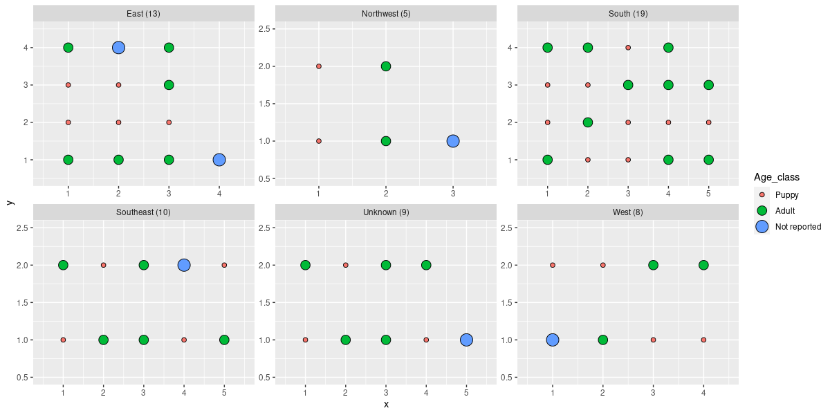
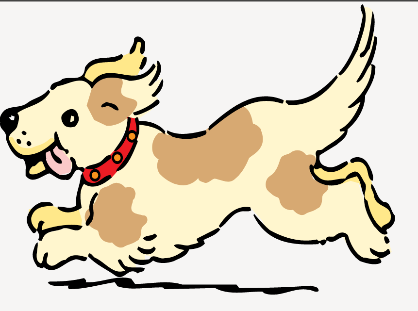
Next, we need an svg image. I downloaded this jumping dog (below) from freesvg.org into my working directory. Next,ggsvg needs this image as text, so we read its contents as a string.
dog_svg <- paste(readLines("dognoclp.svg"), collapse = "\n")For fun, let’s map the age class to the color of the dog’s collar. The ggsvg documentation explains that “we can use the css() helper function to target aesthetics at selected elements within an SVG using css(selector, property = value)”.
To identify the dog collar in the image, I opened the svg in a browser, used the Inspect Element tool, and copied the css selector that I needed.
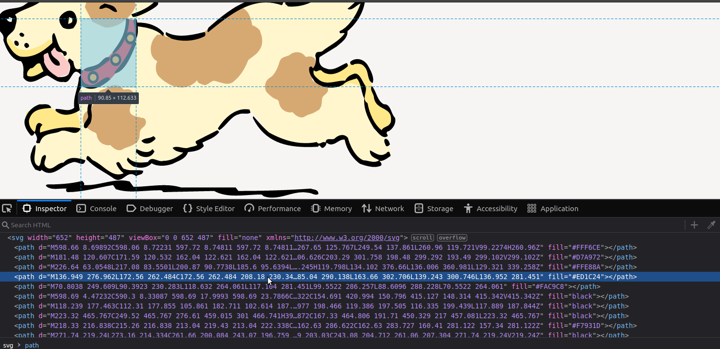
This selector feeds into geom_svg_point() and as the aesthetics argument to scale_svg_fill_manual(). Point size can be mapped to age class, so that puppies appear smaller than adults, and the rest is some minor tweaking to get a nice look. For reference, this includes putting the legend at the bottom with the title above and the labels below.
ggplot(dogsW) +
  geom_raster(aes(x, y), fill = "transparent") +
  geom_point_svg(aes(x, y, css(
    selector = "svg:nth-child(1) > path:nth-child(4)",
    fill = Age_class
  ), size = Age_class), svg = dog_svg) +
  facet_wrap(~Region_n, scales = "free") +
  scale_size_manual(values = c(12, 16, 14), name = "Age") +
  scale_svg_fill_manual(
    aesthetics =
      css(selector = "svg:nth-child(1) > path:nth-child(4)", fill = Age_class),
    values = c("#806cff", "#fdb731", "#194162"), name = "Age"
  ) +
  scale_x_continuous(expand = c(0, 0)) +
  scale_y_continuous(expand = c(0, 0)) +
  ggthemes::theme_few(base_family = "Lato") +
  theme(
    axis.text = element_blank(),
    axis.ticks = element_blank(),
    axis.title = element_blank(),
    strip.text = element_text(face = "bold", size = 18),
    legend.position = "bottom", legend.title = element_text(size = 16)
  ) +
  guides(size = guide_legend(
    title.position = "top", label.position = "bottom",
    title.hjust = 0.5
  ))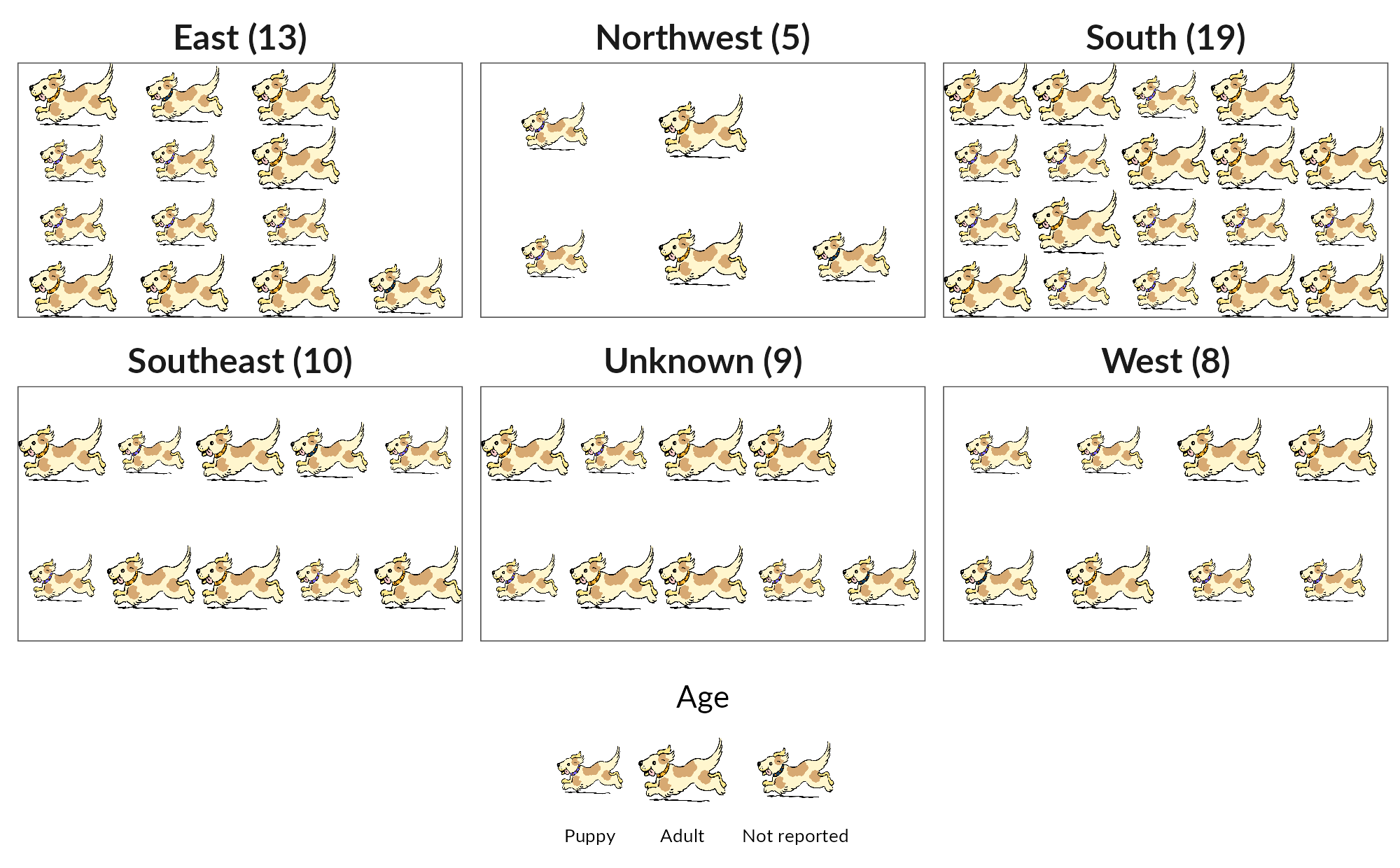
Looks nice! Thanks to Mike FC for developing ggsvg and for help with understanding the css() function.
All feedback welcome.