
With the 2020 NBA playoffs set, someone wrote in an online discussion that it feels like it’s always the same teams reaching the postseason every year. With few exceptions, I haven’t followed many seasons closely since the late 1990s, but I did share that feeling. This somehow led me to try and work out how often teams are reaching the postseason in consecutive years using readily available data. To address this, I transcribed playoff series data from 1992-2020 from the Basketball Reference website, and tried out some set intersects.
This post walks through applying intersects across consecutive pairs of list elements, using the 16 teams (8 per conference) that reach the NBA playoffs each season in relation to the prior year. The following code should be fully reproducible.
Tip-off
First we load the necessary libraries, read the data, pivot from wide to long, and clean up the loose ends.
# load packages
library(readr)     # CRAN v1.3.1
library(dplyr)     # [github::tidyverse/dplyr] v1.0.0.9000
library(stringr)   # CRAN v1.4.0
library(tidyr)     # CRAN v1.1.0
library(purrr)     # CRAN v0.3.4
library(ggplot2)   # CRAN v3.3.1
library(forcats)   # CRAN v0.5.0
library(ggalt)     # CRAN v0.4.0
library(artyfarty) # [github::datarootsio/artyfarty] v0.0.1
library(extrafont) # CRAN v0.17
# read from repository
playoffsrd <- read_csv("https://github.com/luisDVA/codeluis/raw/master/playoffsrdld.csv")
# melt, remove seeds, rename franchises
TeamsSeasons <-
  playoffsrd %>% pivot_longer(WTeam:LTeam,values_to="Teams") %>% select(-name) %>%
  mutate(Teams=str_remove(Teams,"\\s\\(.*")) %>%
  mutate(Teams=case_when(str_detect(Teams,"^Seatt")~"Oklahoma City Thunder",
                         str_detect(Teams,"New Je")~"Brooklyn Nets",
                         str_detect(Teams,"Charlotte Bobcats")~"Charlotte Hornets",
                         str_detect(Teams,"Washington Bullets")~"Washington Wizards",
                         str_detect(Teams,"New Orleans Hornets")~"New Orleans Pelicans",
                         TRUE~Teams))
Resulting in a tidy, long format dataset with seasons, conference, and teams:
> TeamsSeasons
# A tibble: 464 x 3
      Yr conf    Teams
   <dbl> <chr>   <chr>
 1  2020 Western Los Angeles Lakers
 2  2020 Western Portland Trail Blazers
 3  2020 Western Los Angeles Clippers
 4  2020 Western Dallas Mavericks
 5  2020 Western Denver Nuggets
 6  2020 Western Utah Jazz
 7  2020 Western Houston Rockets
 8  2020 Western Oklahoma City Thunder
 9  2020 Eastern Milwaukee Bucks
10  2020 Eastern Orlando Magic
# … with 454 more rows
Now, we can use dplyr::group_split to split the grouped data into a list of vectors.
# split into yearly lists, assign names
allTeamsSeasons <- TeamsSeasons %>% group_split(Yr) %>% purrr::map("Teams")
names(allTeamsSeasons) <-
  TeamsSeasons %>%
  group_by(Yr) %>% group_keys() %>% pull
A quick intersect (Reduce(intersect, allTeamsSeasons)) of all the list elements shows us that no single team has made the playoffs in all the years considered (some of the franchises haven’t even existed for that long).
Because the set of 16 teams that make the playoffs can vary each year, I used a pivoting approach to get all combinations of seasons and teams, including NA values when a team didn’t qualify. If anyone knows of a better approach please let me know.
# spread and gather to get all combinations
teamswide <-
  TeamsSeasons %>%
  mutate(qual = "yes") %>%
  pivot_wider(
    names_from = Yr,
    values_from = qual
  )
teamsQualLong <-
  teamswide %>% pivot_longer(`2020`:`1992`, names_to = "Season")
Let’s see.
> teamsQualLong
# A tibble: 899 x 4
   conf    Teams              Season value
   <chr>   <chr>              <chr>  <chr>
 1 Western Los Angeles Lakers 2020   yes
 2 Western Los Angeles Lakers 2019   NA
 3 Western Los Angeles Lakers 2018   NA
 4 Western Los Angeles Lakers 2017   NA
 5 Western Los Angeles Lakers 2016   NA
 6 Western Los Angeles Lakers 2015   NA
 7 Western Los Angeles Lakers 2014   NA
 8 Western Los Angeles Lakers 2013   yes
 9 Western Los Angeles Lakers 2012   yes
10 Western Los Angeles Lakers 2011   yes
# … with 889 more rows
With this long-format tibble we can already draw a faceted bubble chart to track how individual teams are doing across the whole study period, and this should correspond to what we get when intersecting consecutive list elements.
# bubble chart
ggplot(teamsQualLong) +
  geom_point(aes(x = Season, y = fct_rev(Teams), shape = value, fill = conf), color = "black", size = 4) +
  scale_shape_manual(values = c(21, NA), guide = F) +
  scale_fill_manual(values = c("#003ba6", "#dc0530"), guide = F) +
  facet_grid(rows = vars(conf), scales = "free") +
  labs(
    y = "",
    x = ""
  ) +
  artyfarty::theme_five38() +
  theme(
    text = element_text(size = 18, family = "Loma"),
    axis.text.x = element_text(size = 8),
    strip.background = element_blank(),
    strip.text = element_text(face = "bold", size = 15)
  )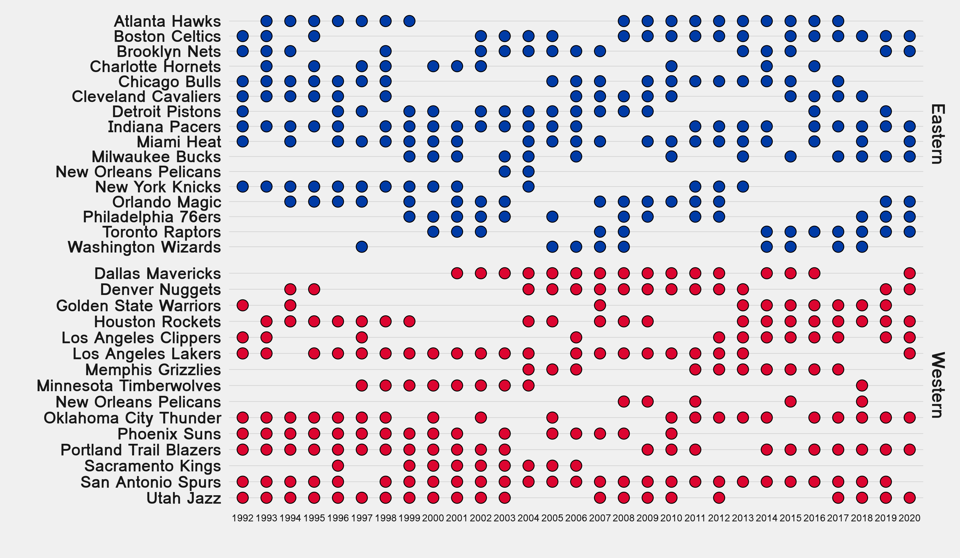
Looks good, even with minimal customization.
Now, we can split the grouped data for each conference into lists.
# list of teams by season and conference
# Eastern
TSList_E <- TeamsSeasons %>%
  filter(conf == "Eastern") %>%
  group_split(Yr) %>%
  purrr::map("Teams")
names(TSList_E) <-
  TeamsSeasons %>%
  filter(conf == "Eastern") %>%
  group_by(Yr) %>%
  group_keys() %>%
  pull()
# Western
TSList_W <- TeamsSeasons %>%
  filter(conf == "Western") %>%
  group_split(Yr) %>%
  purrr::map("Teams")
names(TSList_W) <-
  TeamsSeasons %>%
  filter(conf == "Western") %>%
  group_by(Yr) %>%
  group_keys() %>%
  pull()
… and then apply an intersect over consecutive pairs of list elements with a nifty mapply approach that relies on indices.
# which teams reach playoffs in consecutive seasons
intersect_consecutive <-
  function(veclist) {
    mapply(function(x, y) intersect(x, y), veclist[-length(veclist)], veclist[-1])
  }
yearlyPSeasonTeamsE <- intersect_consecutive(TSList_E)
yearlyPSeasonTeamsW <- intersect_consecutive(TSList_W)
We can now count which teams in a given season also played in the previous years’ postseason.
# how many teams from the previous season made the playoffs in the next one?
turnoverE <- yearlyPSeasonTeamsE %>%
  map_dbl(length) %>%
  tibble::enframe("year", "teams") %>%
  mutate_all(as.numeric) %>%
  mutate(conf = "Eastern Conference")
turnoverW <- yearlyPSeasonTeamsW %>%
  map_dbl(length) %>%
  tibble::enframe("year", "teams") %>%
  mutate_all(as.numeric) %>%
  mutate(conf = "Western Conference")
allSeasonsEWturnover <- bind_rows(turnoverE, turnoverW)
The resulting long-format tibble is also ready for plotting.
> allSeasonsEWturnover
# A tibble: 56 x 3
    year teams conf
   <dbl> <dbl> <chr>
 1  1992     6 Eastern Conference
 2  1993     6 Eastern Conference
 3  1994     6 Eastern Conference
 4  1995     6 Eastern Conference
 5  1996     6 Eastern Conference
 6  1997     5 Eastern Conference
 7  1998     4 Eastern Conference
 8  1999     6 Eastern Conference
 9  2000     7 Eastern Conference
10  2001     5 Eastern Conference
# … with 44 more rows
We and plot these data as line chart with an EKG feel to it using splines from ggalt.
ggplot(allSeasonsEWturnover, aes(x = year, y = teams, color = conf)) +
  geom_xspline(size = 2) +
  scale_color_manual(values = c("#003ba6", "#dc0530"), guide = F) +
  scale_x_continuous(
    breaks = unique(allSeasonsEWturnover$year),
    guide = guide_axis(n.dodge = 2)
  ) +
  facet_grid(~conf) +
  labs(
    y = "Number of teams that made\n the playoffs in previous season",
    x = "Season"
  ) +
  artyfarty::theme_five38() +
  theme(
    text = element_text(size = 18, family = "Loma"),
    axis.text.x = element_text(size = 7),
    strip.background = element_blank(),
    strip.text = element_text(face = "bold", size = 22)
  )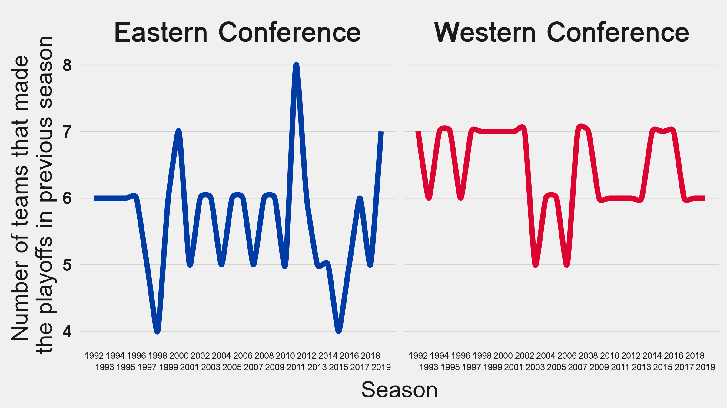
This output checks out with the bubble chart.
At first glance:
- Lots of playoff appearances by the Spurs, sadly breaking their streak this season.
- More teams in the West reappearing in consecutive seasons.
- Long gaps without playoffs for several franchises.
- Same eight teams in the East played in 2011 and 2012. Almost the same teams from last year playing this year in the East.
- Anything else?
All feedback welcome.