
Less bar charts with error bars please
Computer scientists, psychologists, and statisticians have all studied how to create visualizations that communicate data effectively. Graphical perception experiments showed that the human visual system is pretty good at decoding numerical data mapped to the spatial position of a graphical feature (Heer et al. 2010). This may be why bar charts are so popular and widely-used.

To show counts or frequencies of observations for different groups, we can make the length of the bars represent the corresponding values. The problems start when bar charts are also used to show multiple observations for each group. What usually happens is that the length of the bars now represent the group means, and then silly-looking error bars are drawn on top to show standard errors or standard deviations for the means. These plots are also known as ‘dynamite plunger plots’ because they look like the detonator boxes from cartoons.

Bar charts for multiple observations are not good because:
- they conceal the underlying data, so we cannot see the its distribution or the sample size
- they look pretty lame
I’m writing this quick post after teaching a ggplot workshop last month, followed by attending two biology conferences where I saw these plots used by students, plenary speakers, bioinformaticians, and various other researchers. In 2016, Helena Jambor also noted how prevalent these charts are, even in top journals.
Alternatives to the bar chart
I’m not the first to call for less of these plots, but I want to share some alernatives that I haven’t seen implemented too often.
First of all, why draw bars if we can show the underlying data points, or at least show more information about the distribution of the data, or some nice parametric summaries (e.g. box plots, violins, etc.).
This tweet speaks for itself, and all those options can be made in ggplot with the right packages and extensions (e.g. ggforce and ggbeeswarm).
Comparison of sina plot with other styles. This is a great suggestion. pic.twitter.com/2Pf66E7PFi
— Tim Triche, Jr. (@timtriche) October 29, 2018
If for some reason we absolutely need to plot bars for multiple observations per group, the approach below may be an option. At this point it’s pretty hacky, but I think something like this could be made into a custom geom by anyone who is good at ggproto.
Here’s how it works:
- Generate random values within the bounds of the mean plus or minus the standard error.
- Overlay semi-transparent bars to show the range of the standard error.
- Draw a bar with an outline but no fill to show the point estimate (the mean).
This is not meant to show the sample size or underlying distribution of the data, but it shows the estimates and standard errors without looking as lame. I was mostly interested in learning the data manipulation steps needed to generate the random values. I have to admit that I could not figure out how to add the layers iteratively, so there is a lot of copying and pasting.
Let’s work through the typical bar charts first:
These are the means for one of the variables (total sleeping time) in the built-in mammalian sleep dataset, by dietary guild.
library(ggplot2)
library(dplyr)
library(tidyr)
library(ggthemes)

# summarize by guild
msleep_summary <-
msleep %>% filter(!is.na(vore)) %>%
  group_by(vore) %>%
  summarise(total_sleep=mean(sleep_total),sleep_se=sd(sleep_total)/sqrt(n())) %>%
  mutate(diet=paste0(vore,"vore"))

# plot
ggplot(msleep_summary,aes(diet,total_sleep))+
  geom_col(fill="#8ad2f2",color="#0db5c1")+theme_base()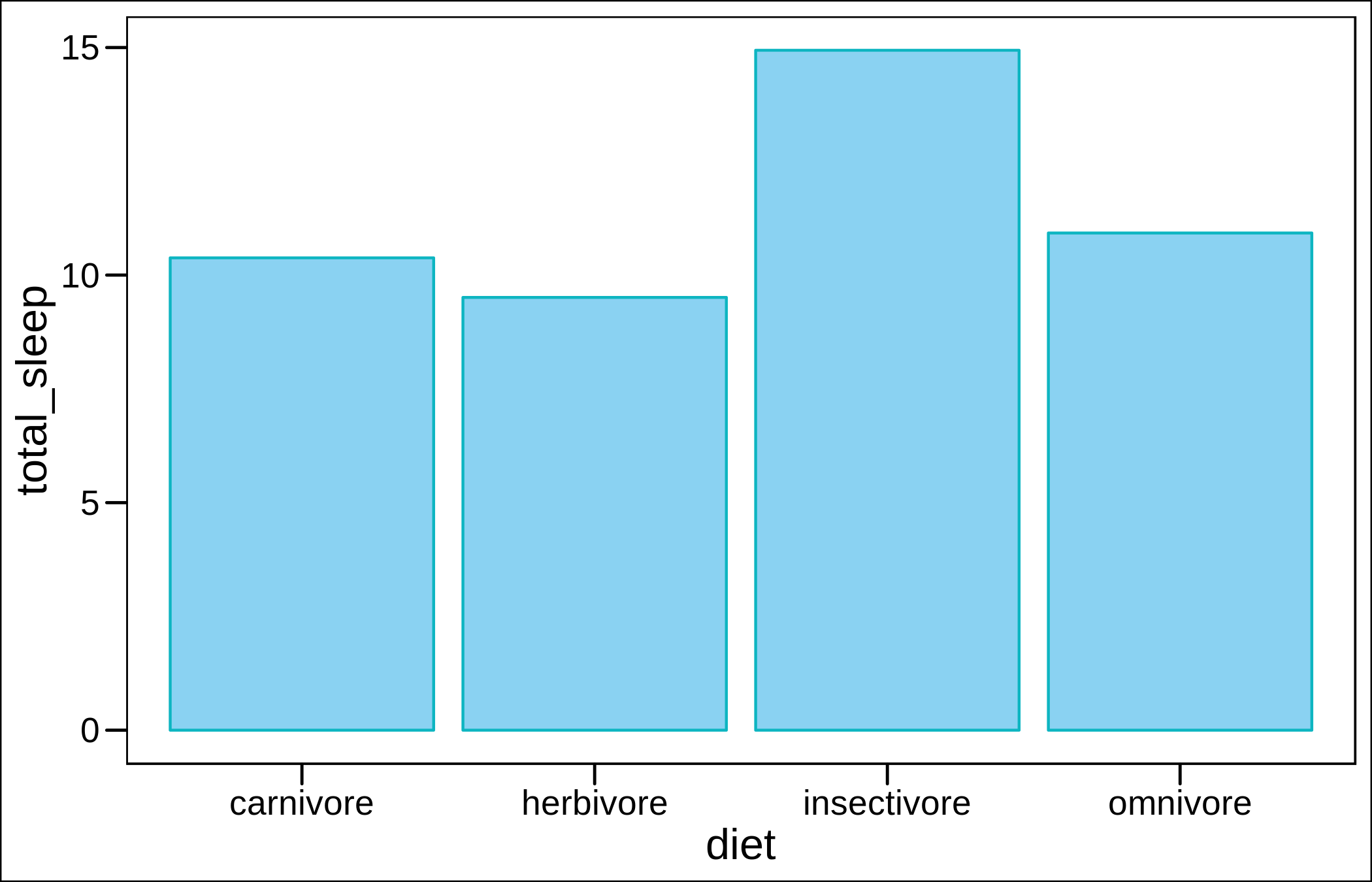
Now with error bars.
# with error bars
ggplot(msleep_summary,aes(diet,total_sleep))+
  geom_col(fill="#8ad2f2",color="#0db5c1")+
  geom_errorbar(aes(ymin=total_sleep-sleep_se,ymax=total_sleep+sleep_se),width=0.4)+
  theme_base()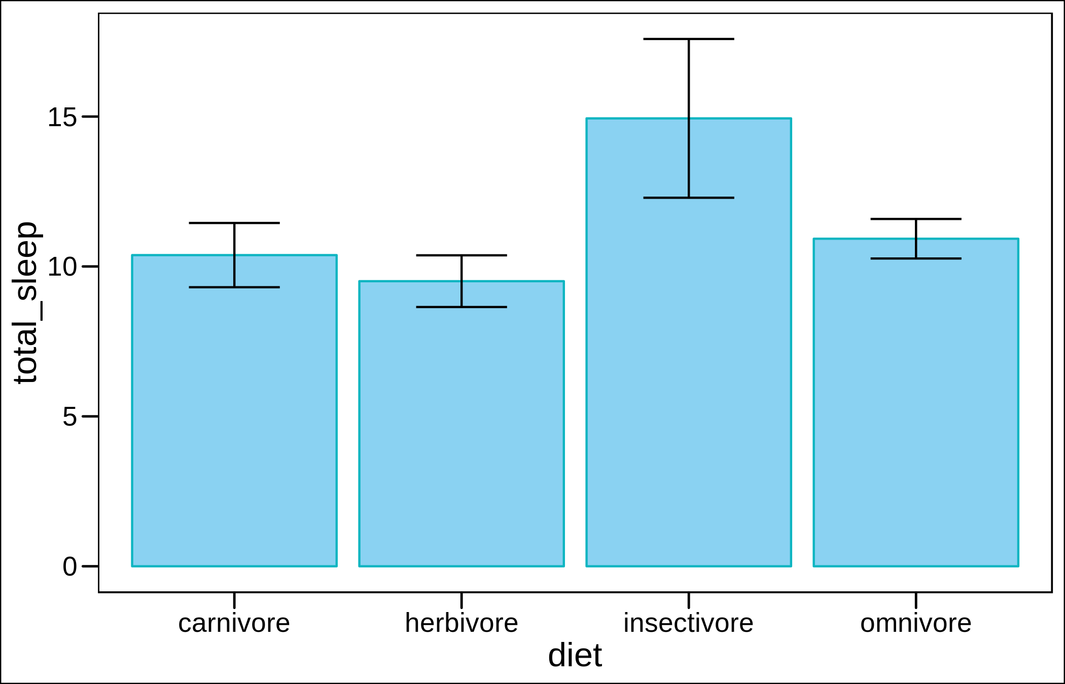
Now bars for the means, and the lower and upper bounds of the estimates.
ggplot(msleep_summary,aes(diet,total_sleep))+
  geom_col(aes(y=total_sleep+sleep_se),alpha=0.6,fill="#8ad2f2")+
  geom_col(alpha=0,color="#0db5c1")+
  geom_col(aes(y=total_sleep-sleep_se),alpha=0.6,fill="#8ad2f2")+theme_base()
We need several steps to create a separate wide-form dataset of random values within the range of the standard errors for each group.
# generate data within the se bounds
msleep_summary_ser <-
msleep_summary %>%
  group_by(diet) %>%
  do(data.frame(se_range=runif(20,min=.$total_sleep-.$sleep_se,max=.$total_sleep+.$sleep_se))) %>%
  left_join(msleep_summary) %>% arrange(diet,se_range) %>%
  mutate(gid=row_number()) %>%
  mutate(serID=paste0("se",gid))

# reshape
msleep_ser_wide <-
    msleep_summary_ser %>%
    select(diet,se_range,serID) %>% tibble::rowid_to_column() %>%
      spread(serID,-diet)
The plotting code is a mess but bear with me.
ggplot(msleep_summary,aes(diet,total_sleep))+
  geom_col(color="black",alpha=0)+
  geom_col(data=msleep_ser_wide,aes(x=diet,y=se1),alpha=0.2,fill="#71B9D9")+
  geom_col(data=msleep_ser_wide,aes(x=diet,y=se2),alpha=0.03,fill="#71B9D9")+
  geom_col(data=msleep_ser_wide,aes(x=diet,y=se3),alpha=0.03,fill="#71B9D9")+
  geom_col(data=msleep_ser_wide,aes(x=diet,y=se4),alpha=0.03,fill="#71B9D9")+
  geom_col(data=msleep_ser_wide,aes(x=diet,y=se5),alpha=0.03,fill="#71B9D9")+
  geom_col(data=msleep_ser_wide,aes(x=diet,y=se6),alpha=0.03,fill="#71B9D9")+
  geom_col(data=msleep_ser_wide,aes(x=diet,y=se7),alpha=0.03,fill="#71B9D9")+
  geom_col(data=msleep_ser_wide,aes(x=diet,y=se8),alpha=0.03,fill="#71B9D9")+
  geom_col(data=msleep_ser_wide,aes(x=diet,y=se9),alpha=0.03,fill="#71B9D9")+
  geom_col(data=msleep_ser_wide,aes(x=diet,y=se10),alpha=0.03,fill="#71B9D9")+
  geom_col(data=msleep_ser_wide,aes(x=diet,y=se11),alpha=0.03,fill="#71B9D9")+
  geom_col(data=msleep_ser_wide,aes(x=diet,y=se12),alpha=0.03,fill="#71B9D9")+
  geom_col(data=msleep_ser_wide,aes(x=diet,y=se13),alpha=0.03,fill="#71B9D9")+
  geom_col(data=msleep_ser_wide,aes(x=diet,y=se14),alpha=0.03,fill="#71B9D9")+
  geom_col(data=msleep_ser_wide,aes(x=diet,y=se15),alpha=0.03,fill="#71B9D9")+
  geom_col(data=msleep_ser_wide,aes(x=diet,y=se16),alpha=0.03,fill="#71B9D9")+
  geom_col(data=msleep_ser_wide,aes(x=diet,y=se17),alpha=0.03,fill="#71B9D9")+
  geom_col(data=msleep_ser_wide,aes(x=diet,y=se18),alpha=0.03,fill="#71B9D9")+
  geom_col(data=msleep_ser_wide,aes(x=diet,y=se19),alpha=0.03,fill="#71B9D9")+
  geom_col(data=msleep_ser_wide,aes(x=diet,y=se20),alpha=0.03,fill="#71B9D9")+
  theme_base()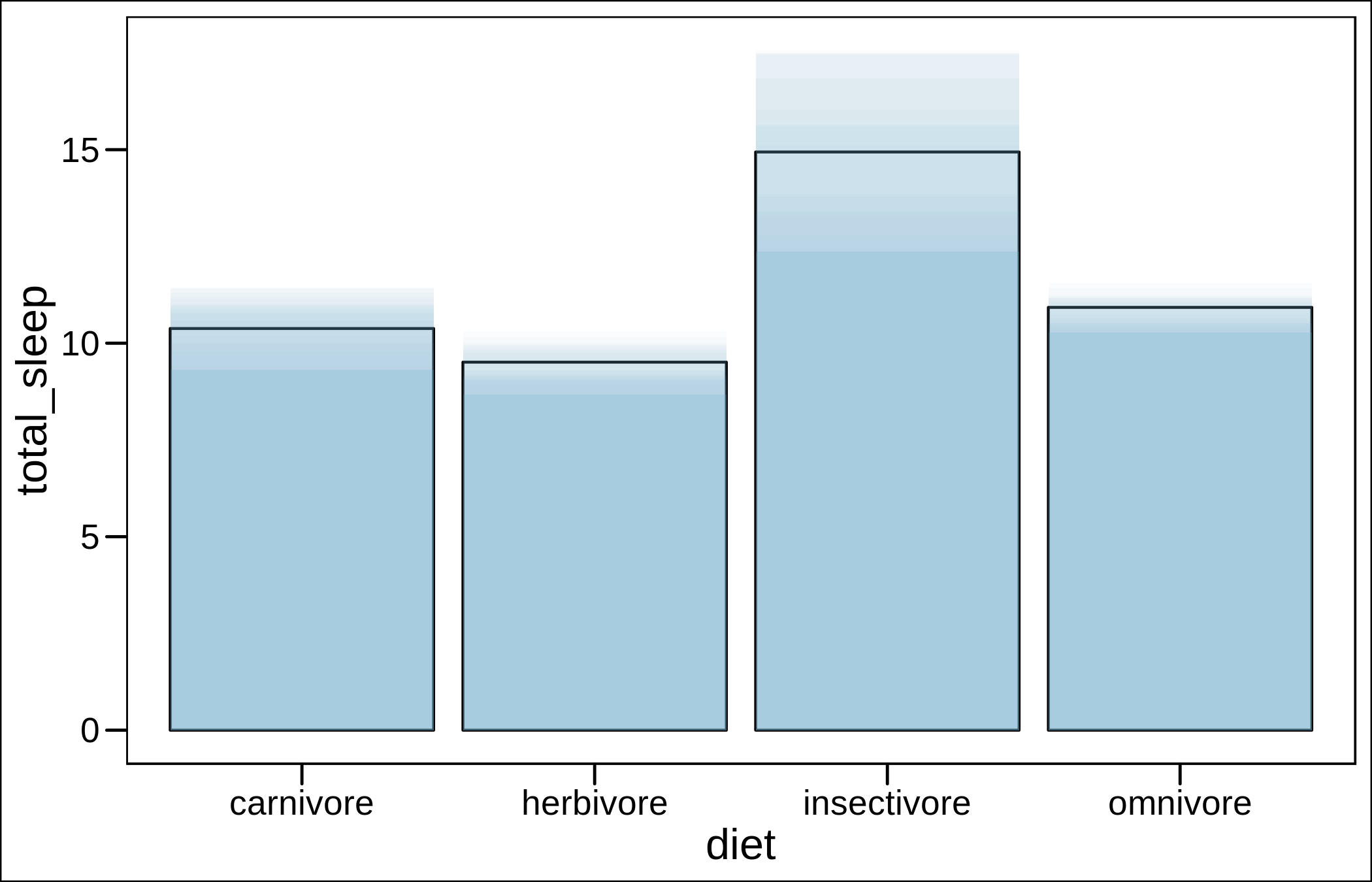
It looks OK, but I would personally use a sina plot instead (and I did in my last publication on bats).
library(ggforce)
msleep %>% filter(!is.na(vore)) %>%
   mutate(diet=paste0(vore,"vore")) %>%
   ggplot(aes(diet,sleep_total))+
      geom_sina(shape=21,fill="#71B9D9",binwidth=0.6)+theme_base()+labs(y="total_sleep")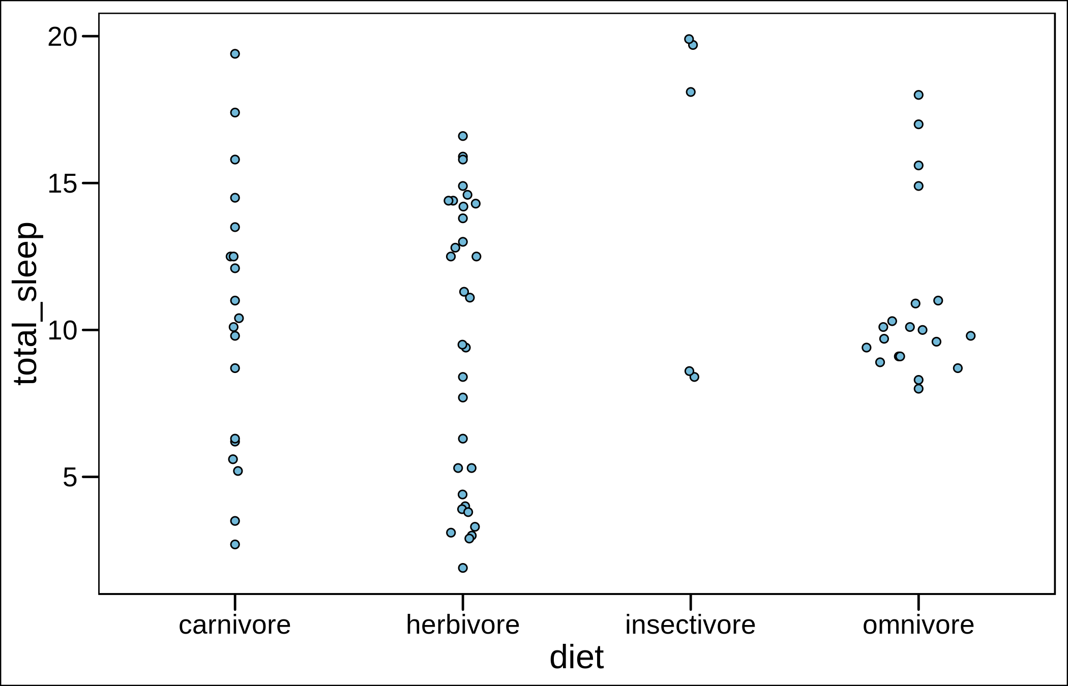
Contact me if you have any feedback or questions.
References
Heer, Jeffrey, Michael Bostock, and Vadim Ogievetsky. “A tour through the visualization zoo.” Commun. Acm 53.6 (2010): 59-67.