
In the past few months I wrote a couple of blog posts (here and here) about the need to collect and analyse data that describes the content presented at biology conferences, as well as data on the demographics of the presenters. In my spare time, I’ve been putting together a dataset of conference content. I analyse part of these data for this post as a way to share some curious spatial patterns in conservation research, and to document my first steps towards using R for GIS analyses.
Part of my data looks like this:
| author institution | author country | study country | topic | study focus |
|---|---|---|---|---|
| Western Australian Museum | Australia | Australia | fire ecology | reptiles |
| City University of New York | USA | USA | climate change effects | shorebirds |
| Wildlife Conservation Society | USA | Rwanda | socioeconomics | national parks |
| Norwegian University of Life Sciences | Norway | India | human-wildlife conflict | tigers |
Each row represents an abstract for work presented at the 25th International Congress for Conservation Biology (ICCB) in Auckland, New Zealand in 2011. For this particular data visualisation, we are interested in the two columns that list: the countries where the different presenters are based and where their study sites are. From what is essentially a table with two columns representing author country and study country, I counted the number of presentations reporting “in-country” research (for example: someone based in New Zealand talking about parrot conservation in New Zealand), and worked out the “cross-boundary” connections (for example: someone based in the USA presenting a study on amphibians at a field site in Africa).
On a map, in-country research can be visualised by colour-coding countries with count data, and the cross-boundary connections can be shown using lines linking author and study countries. The map in this post shows a reduced sample of the whole conference data (300 out of ~900 abstracts), and not all conference material can be mapped. Unmappable abstracts include presentations on theory, methods, or global meta-analyses that don’t have a clear study site.
I wanted to map this in R, and I’ll admit that for a while I was scared that I would never be comfortable or efficient without pretty GUIs and the clickable layers and menus that I was so used to in ESRI software. However, once I had a rough idea of what I wanted to do, I soon found a wealth of R packages that make spatial analysis easy and fun (have a look at this post by Chris Brown about the importance and future of accessible and well-documented packages for spatial analysis in R).
Mapping
The annotated code to reproduce the map is in the Gist embedded at the end of this post. The five main steps towards making this map were:
Counting the in-country research
An easy task thanks to dplyr.
Geocoding the points to connect
Rather than drawing lines between the centroids of the connected countries, I opted to use the location of each countries’ capital city. To do this: I scraped a simple table of world capitals from the web, joined it to my data and then used the mutate_geocode function in ggmap to get the coordinates for each point. I also used jitterDupCoords from the geoR package to jitter any duplicated coordinates and bring out the connections that were hidden beneath overlapping lines.
Visualising in-country research
The rworldmap package comes with functions to join user data with an internal world map using country names, which can then be plotted with flexible graphical options.
Get lines to connect points
The best way to visualise geographic connections is using shortest-path lines (great circles). The gcIntermediate function in geosphere is well documented, and I took ideas from these blog posts to work out intermediate points along the great circle, which can then be drawn as lines.
Plot lines and points
I plotted the points for author and study countries in different colours to show that connections are often not reciprocal.
Final map
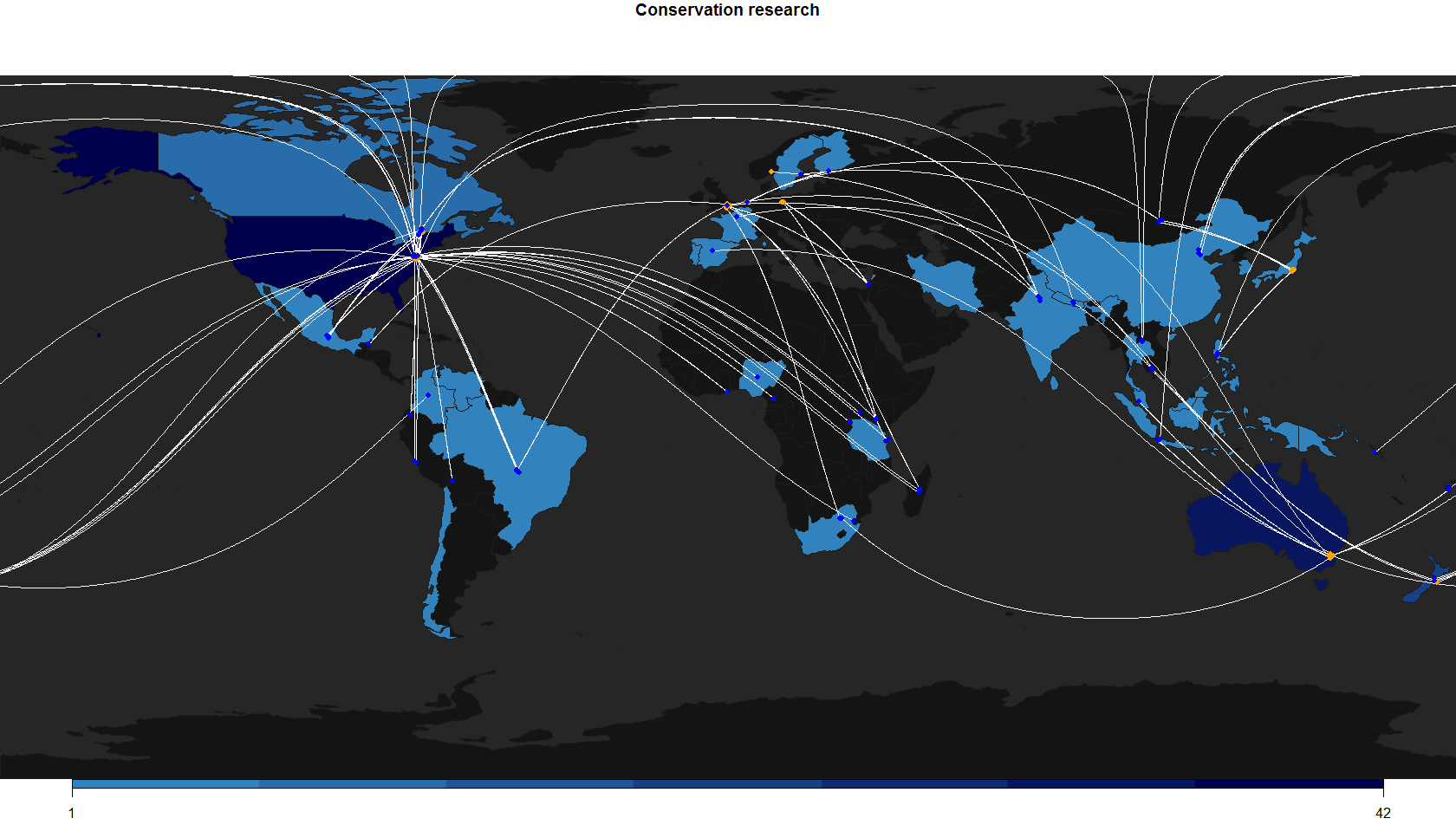
Spatial patterns
There is no arguing with the fact that a lot of conservation research done on species, ecosystems, and human communities in threatened, tropical, and biodiverse areas is often done by scientists that live and work elsewhere. The socioeconomics are complicated, and any biases in research effort are not easy to detect or measure. Additionally, conservation research is a collaborative field with highly mobile scientists.
Without overreaching, here are a few observations from the map and data:
-
There were 58 unique connections between countries, and 33 countries with at least one study presented by someone based in the respective country.
-
The UK had lots of connections in this dataset, but no in-country research. Countries with more in-house research tend to have more connections.
-
The USA had the most in-country research, followed by Australia and New Zealand (not surprising given the location of the conference and the multiple factors that explain research output in the USA).
-
Many African and Western Asian countries not represented, neither by local nor overseas researchers.
I’ll keep analysing and expanding this dataset, so expect more updates in the future. For any questions, mistakes in the code, comments, or if anyone is interested in these data, contact me.
Code and data