
Bar plots are an effective way of showing the values of grouped data within categories. I recently struggled when making some using ggplot, and after finally getting them right I decided to write this post. I hope people can find this if they ever get stuck when using ggplot to create a grouped bar plot with labels for each bar. For anyone with experience in data visualization, this is a straightforward task. For everyone else (and as future reference for myself), I’ll go through the steps needed to build the plot, including a brief explanation for the important arguments. There are lots of guides and posts online on how to do this, but I found that they lacked the detail needed to help those who get stuck.
This dataset is inspired by the actual data I was trying to plot. It has groups (the type of critter caught), bar heights (number of captures), and different values for each critter in each forest layer that can be plotted side by side.
| critter | trapped | individuals |
|---|---|---|
| mouse | ground | 2 |
| mouse | mid-canopy | 8 |
| mouse | upper-canopy | 15 |
| opossum | ground | 11 |
| opossum | mid-canopy | 5 |
| opossum | upper-canopy | 0 |
For anyone not on board with ggplot, here’s a well-written post by The Coatless Professor on making grouped barplots using base graphics.
First, let’s replicate the table above. Notice that the data has a consistent order such that the critter entries are grouped together and the trapped variable has a cyclic ordering. In this example, opossums were not caught in the upper canopy but there is still a row for this, because 0 is data.
# making the data frame
newDataFr <- data.frame(critter=c(rep("mouse",3),rep("opossum",3)),
                        trapped=rep(c("ground","mid-canopy","upper-canopy"),2),
                        individuals= c(2,8,15,11,5,0) )
The data structure is ready for plotting, and this can all be done with ggplot() to initialize a ggplot object and geom_bar() to draw the bars.
#if you don't have the packages you can install them all from CRAN using install.packages()
library(ggplot)
library(ggthemes)
library(palettetown)
# plot the data
ggplot(newDataFr)+
  geom_bar(aes(y=individuals,x=critter,fill=trapped),position="dodge",stat="identity")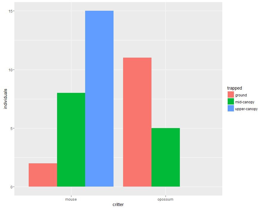
We want the heights of the bars to represent values in the data, so we use stat=”identity” and map a variable to the y aesthetic. We use position=”dodge” to literally dodge any overlaps and adjust the position of the bars to be side by side.
For the next plot, I got fancy and used two additional packages to change the overall look of the plot and add some nice colors to the bars. I also used guide and ylab to make changes to the legend title and the label for the y axis. The pander theme from the ggthemes package will change the general aspect of the plot such as the colour of the background, gridlines, and the size and colour of fonts. It actually comes from an effort to unify the plot outpot from the different graph engines (graphics, lattice, ggplot). The scale_fill_poke() function comes from the palettetown package by Tim D. Lucas, it contains several pokemon-inspired color palettes, and I personally like the color schemes in most of the little characters (also, I helped Tim with selecting some palettes that are colorblind friendly).
ggplot(newDataFr)+
  geom_bar(aes(y=individuals,x=critter,fill=trapped),position="dodge",stat="identity")+
  theme_pander()+guides(fill=guide_legend(title="Forest strata"))+ylab("number of captures")+
  scale_fill_poke(pokemon = 9,spread=3) #see the documentation for palettetown

I think this plot looks nicer and less cluttered, but without grid lines, it can be hard to know exactly how many little mammals were caught at each of the forest layers. Luckily, it’s easy to add text labels above each bar. Just a matter of using geom_text(), giving it the labels that will go over each bar and the positions for each one using x and y OR SO I THOUGHT.
ggplot(newDataFr)+
  geom_bar(aes(y=individuals,x=critter,fill=trapped),position="dodge",stat="identity")+
  theme_pander()+guides(fill=guide_legend(title="Forest strata"))+ylab("number of captures")+
  scale_fill_poke(pokemon = 9,spread=3)+
  geom_text(aes(label =individuals,y=individuals, x=critter),vjust=-.5,position=position_dodge(width =1))
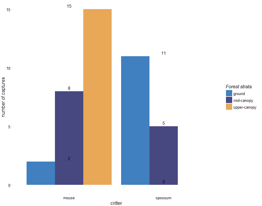
The labels in the plot above are not side by side above their corresponding bar. I fiddled with the aesthetics for geom_text for a while and after many searches and tutorials I was getting nowhere. At some point I closed everything, started again from scratch and in the process I unknowingly put the general aesthetics in the call to ggplot and not in the call to geom_bar(). This made the plot I wanted, including a 0 where it needs to be. I’m still looking into why this happens, it must be the way in which the aesthetic parameters are inherited. Once I have an explanation I’ll update this post, but if anyone knows PLEASE let me know.
ggplot(newDataFr,aes(y=individuals,x=critter,fill=trapped))+
  geom_bar(position="dodge",stat="identity")+
  theme_pander()+guides(fill=guide_legend(title="Forest strata"))+ylab("number of captures")+
  scale_fill_poke(pokemon = 9,spread=3)+
  geom_text(aes(label =individuals,y=individuals, x=critter),vjust=-.5,position=position_dodge(width =1))
  #vjust can move the labels up and down