
pls don’t do this :(
Three common bad practices in sharing tables and spreadsheets and how to avoid them.
Update. 06/10/2018: I’ve updated this post, mainly with better nomenclature and more links to useful solutions for most spreadsheet woes.
Update. 27/02/2018: I noticed that this post is regularly receiving visitors from other sites such as the ones linked below, so I’ve made some updates. I expanded some explanations and now link to a way of tidying up annoying header rows (non-data rows embedded in the data rectangle).
Content from this post appears in the following relevant links:
Mark Isken Business Analytics coursework - Spreadsheet resources
Data Champions
Karl Broman’s Data Organization resources
Jenny Bryan’s spreadsheet resources
The Turing Way guide to reproducible data science
Update. 16/5/2016: After writing this post I, came across this presentation by Richard Jones at the recent CSV2016 conference, which includes a slide on “The weird things humans do with spreadsheets”. Check it out.
In the past month I’ve been busy with collaborations, and by coincidence all the projects that I’m involved with reached the stage of actually having completed datasets at the same time. This has involved me receiving data via email or shared web folders. So far, all these data have come in Excel spreadsheets. Personally, I don’t have anything against xls files and I don’t judge others for working with spreadsheets. However, with this post I want to share three common spreadsheet practices that we should all avoid when preparing and sharing data in a tabular format.
These are all things I’ve done in the past, but they add complication and slow things down at the time of analysis and data manipulation.
There are some workarounds and cool new ways to solve the complications programmatically (see below). However, it’s easier if those with the original data avoid messy spreadsheet practices from the start. In no particular order: these are three spreadsheet practices that I see all the time, with examples and suggestions for improvement.
1 Color-coding and other formatting (meaningful formatting)
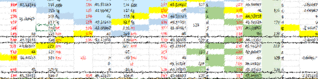
Spreadsheet programs let us format cells and their content with different colors, borders, font types, etc. Highlighted cells are a good visual aid, and sometimes I use them - but never when I plan on sharing the files with anyone else. By doing this, whatever the color represents is stacked with the actual data in the cell, with no easy way to separate these two (or more) values.
If you rely heavily on cell formatting as a way to store data, consider what would happen if the colors or font types were stripped away (e.g. when collaborating with someone who may not be aware of the importance of the formatting, or when changing file formats to a plain text .tsv or .csv).
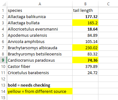
Suggestion: add additional indicator columns with the information that was being conferred by the formatting. It might look redundant but it’s an incredible time saver and very convenient within scripting languages.
R users can now handle formatted Excel spreadsheets thanks to Duncan Garmonsway’s tidyxl package, which is very well documented in the associated Data Munging Strategies book. I used it to deal with formatted data in this post, and as of early 2020 meaningful formatting can be flattened into text annotations using the unheadrpackage.
2. Merged cells
Merged cells will look good in the final version of a table, but they can lead to strange behaviours when trying to read and manipulate the data with other programs.
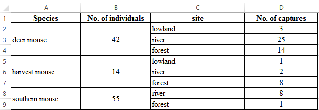
Suggestion: Duplicate the content that was merged in the first place. This kind of melted presentation is actually preferable when analyzing or visualizing the data.
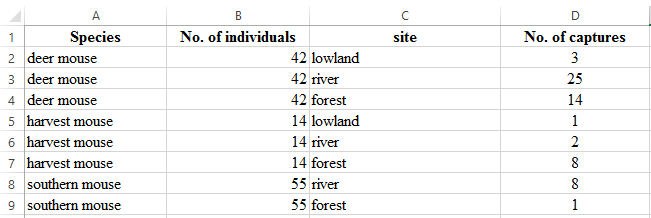
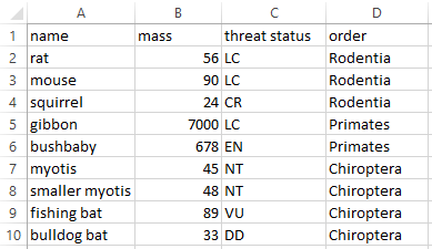
3. Embedded subheaders
This is a very common practice for data that follows some hierarchy. I see this often in papers from my field because this arrangement can convey the geographic or taxonomic membership of different observations to whatever is referred to below a subheader row until a new one implies otherwise. A summary of embedded subheaders and my work with them is available here. I built the unheadr package (now on CRAN) specifically for this.
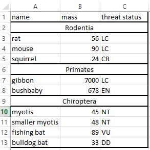
Suggestion: Same as before, add an indicator column specifying the membership of each row.
Update: This post by Jenny Bryan (RStudio/UBC) describes a function to untangle these pesky rows using R and the magic of tidy evaluation, and this one shows my motivation for sorting this out programatically.
That’s it. All the suggested changes might make the tables less appealing visually, but they structure the data in a way that saves everyone time. No more sunny afternoons wasted fixing tables by hand.