Set the breaks!
Last month I was trying to make a figure in ggplot in which the legend did not include certain elements present in the plot. I though it would be straightforward, but I was wrong.
This is my actual search history from that day:
ggplot2 omit legend element
tidyverse ggplot legend guide
ggplot remove legend element
ggplot2 remove legend item
ggplot r exclude from legend
extra legend elements ggplot2
remove legend portion ggplot
tidyverse legend guide
Ctenomys leucodon
r suppress legend factor
ggplot legends cookbook
None of the search results seemed to point me in the right direction, and after not getting anywhere I decided to ask on Twitter:
#rstats crew,
— Luis D. Verde (@LuisDVerde) January 10, 2018
help pls: How can I exclude certain legend elements in #ggplot2?
e.g. drop the black line from this legend but not from the plot pic.twitter.com/KtgvuYA9Oq
Several knowledgeable and helpful people suggested using separate geoms and drawing the legend from a geom that excluded the data for the unwanted legend element.
That made sense, and I would have totally gone for that approach If I hadn’t been working with a fancy ggtree geom that I couldn’t easily duplicate. Otherwise I could have edited the legend manually in a graphics program as a last resort.
Luckily, Hadley Wickham solved my question with this three-word tweet:
Set the breaks
— Hadley Wickham (@hadleywickham) January 10, 2018
It looks like the breaks argument that goes into the scale_*_ functions (fill, colour, linetype, shape, etc.) can not only be used to reorder items in the legend, but also to exclude them. I guess it rarely makes sense to have things on a plot with no corresponding legend entry, but I’m posting this to document this use-case and behavior of setting the breaks. Various other ggplot users were unaware of this, so I don’t feel too silly writing this post.
The legend Guide in the official Tidyverse ggplot2 documentation does not include the terms exclude, omit, or drop. Maybe there’s a good reason for this, but in any case I was feeling emboldened by a talk I saw at RStudio::conf about contributing to the Tidyverse, so I’ve created a pull request to incorporate an example like the one below into the documentation.
Let’s try it out.
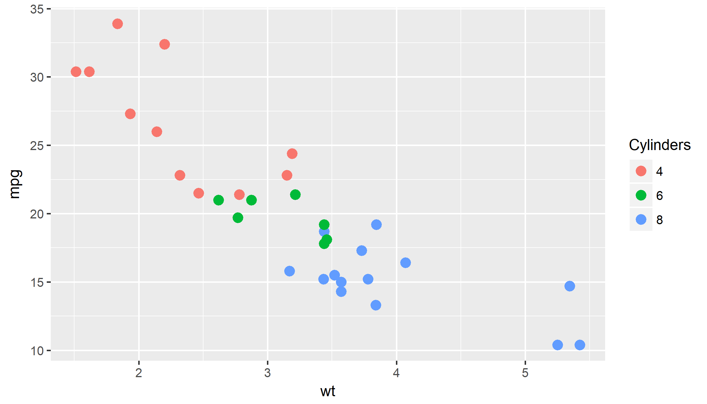
This will create the typical scatterplot of weight vs. miles per gallon for the mtcars dataset, with the type of engine shown with different colors.
library(ggplot2)

ggplot(mtcars) +
  geom_point(aes(wt, mpg,colour = factor(cyl)), size = 3)+
  scale_color_discrete(name="Cylinders")
This will generate the same plot, but excluding the six cylinder category from the items in the legend. The points are still in the plot and in this case it’s kind of weird to not show what they represent.
ggplot(mtcars) +
  geom_point(aes(wt, mpg,colour = factor(cyl)), size = 3)+
  scale_color_discrete(breaks=c(4,8), name="Cylinders")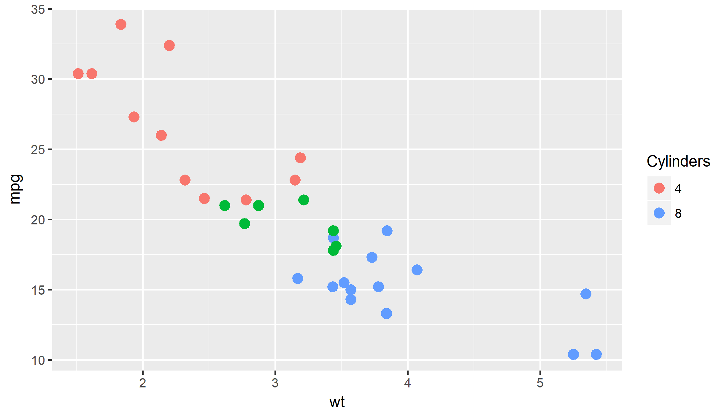
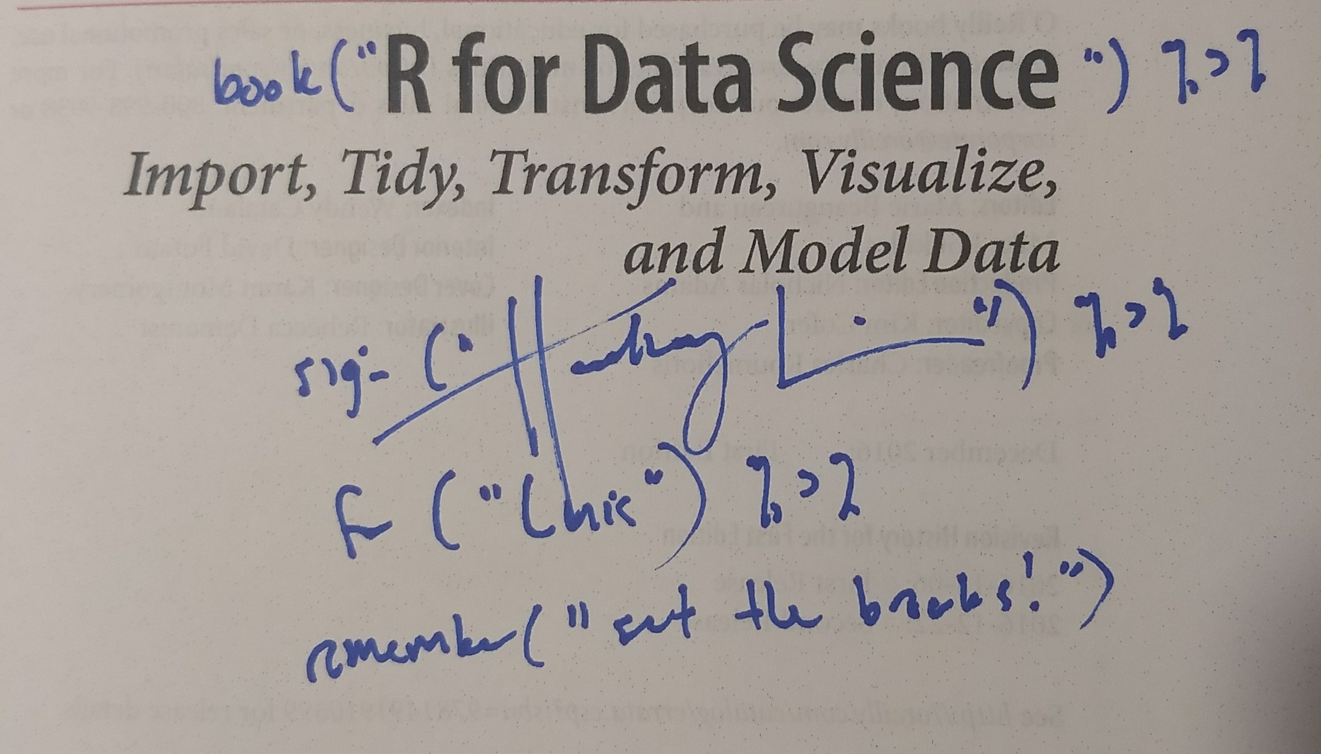
I you’re a phylo person and use ggtree to highlight clades this will come in handy, otherwise I hope this is still a somewhat useful resource on setting breaks. I was so happy and thankful to complete my figure that I asked Hadley for a permanent reminder to set the breaks in my R4DS book.