
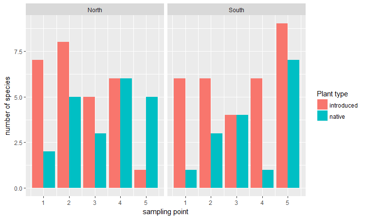
Bar plots are a good way to show continuous (or count) data that is grouped into categories. When we don’t have too many categories (~4 or fewer), plotting bars side by side (dodged) is probably the most straightforward and common solution.
Here is an example for some vegetation data in which the richness of native vs. introduced plant species was measured at five sampling points along the two slopes of a ravine.
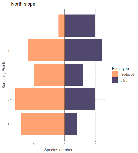
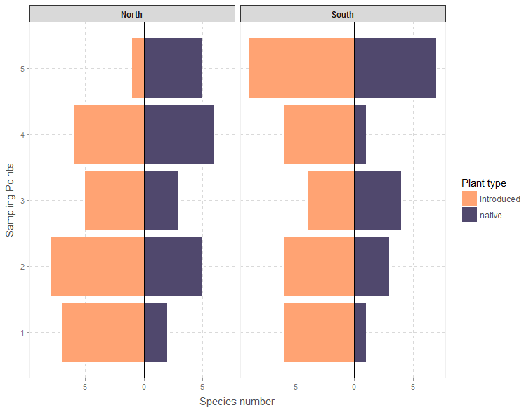
If we have only two categories and we want to show the contrast in values between the two, then diverging ‘stacked’ bar plots (thanks to data scientist Matt Sandy @appupio for the terminology) look to be a pretty effective visualization strategy.
Last month, as part of a group exercise at a workshop, we were plotting some vegetation data with only two categories. My suggestion was to plot dodged bars, but marine biologist Antonio Canepa Oneto sketched a diverging bar plot on paper and suggested we give that a try. I had never tried to make a plot like this and I couldn’t find any documentation for making such plots in R, but after a few minutes of fiddling with the stat argument in ggplot2 we were able to make a nice figure that really highlighted the differences in values between two groups.
Since then I’ve noticed these types of plots online, mainly in some journalistic figures for topics that involved very dichotomous variables (pro and versus GMO, US elections, etc.).
Here’s some R code to create stacked bar charts using ggplot2. The figure below should be fully reproducible, and it more or less follows the type of plot of plant diversity that inspired this post.
The block of code below goes through five major steps to produce the following figures:
Both of these figures use custom themes from Bart Smeets’ artyfarty package.
- Set up some sample data, representing two parallel vegetation transects on different slopes of a ravine in which native vs introduced plants were recorded at five sampling points. This is already in ‘long’ form.
- Conditionally invert the signs for the values of one of the two categories (in this case multiplying all the introduced species richness values by -1.
- Plot the bars using stat=”identity” and position=”identity”, using coord_flip to rotate the axes.
- Re-specify the y axis breaks and labels using the pretty function and the abs function because the values weren’t really negative. This helps us avoid having to define the ‘mirrored’ axis manually.
- Make the figures pretty using the artyfarty package, and use facet wrapping to summarize even more data.
# long-form vegetation survey data
# these data should more or less reflect the vegetation patterns at "Quebrada de Cordoba", Chile

vegSurvey <-
data.frame(sampling_point=rep(c(1:5),4),
           slope=c(rep("North",10),rep("South",10)),
           veg_Type=rep(c(rep("native",5),rep("introduced",5)),2),
           spp=as.integer(abs(rnorm(20,5,2))))
vegSurvey$spp <-   ifelse(vegSurvey$veg_Type =="introduced",vegSurvey$spp+1,vegSurvey$spp)

library(dplyr)
library(ggplot2)
library(extrafont)
devtools::install_github('bart6114/artyfarty')
library(artyfarty)

vegSurvey <- vegSurvey %>%  mutate(sppInv= ifelse(veg_Type =="native",spp,spp*-1))

# plot for only the North slope

vegSurvey %>% filter(slope=="North") %>%
ggplot(aes(x=sampling_point, y=sppInv, fill=veg_Type))+
  geom_bar(stat="identity",position="identity")+
  xlab("sampling point")+ylab("number of species")+
  scale_fill_manual(name="Plant type",values = c("#FFA373","#50486D"))+
  coord_flip()+ggtitle("North slope")+
  geom_hline(yintercept=0)+
  xlab("Sampling Points")+
  ylab("Species number")+
  scale_y_continuous(breaks = pretty(vegSurvey$sppInv),labels = abs(pretty(vegSurvey$sppInv)))+
  theme_scientific()

# plot for both slopes using facetting

ggplot(vegSurvey, aes(x=sampling_point, y=sppInv, fill=veg_Type))+
  geom_bar(stat="identity",position="identity")+
  facet_wrap(~slope)+xlab("sampling point")+ylab("number of species")+
  scale_fill_manual(name="Plant type",values = c("#FFA373","#50486D"))+
  coord_flip()+
  geom_hline(yintercept=0)+
  xlab("Sampling Points")+
  ylab("Species number")+
  scale_y_continuous(breaks = pretty(vegSurvey$sppInv),labels = abs(pretty(vegSurvey$sppInv)))+
  theme_scientific()+
  theme(strip.text.x = element_text(face = "bold"))
If you found this useful, or if any parts of the code aren’t working for you, please let me know.