
pupdate - Nov 2017. Claus Wilke has added a ‘jittered points’ option to the ridgeline geom that basically does the same as my hacky beeswarm approach but with less code. I added an example of this feature to the post.
pupdate - Oct 2017. I’ve update this post to reflect the project-wide renaming of the ggridges package and added more code annotation.
In recent weeks there has been much interest in making cool-looking plots of overlapping density distributions. Basically: stacking many overlapping polygons/ribbons for a nice visual effect.
I saw this kind of plot a few weeks back in a New York Times infographic, with several more examples appearing in my Twitter feed this month. Most notably, the Free Time survey plot.
Peak time for sports and leisure #dataviz. About time for a joyplot; might do a write-up on them. #rstats code at https://t.co/Q2AgW068Wa pic.twitter.com/SVT6pkB2hB
— Henrik Lindberg (@hnrklndbrg) July 8, 2017
The overlapping density plots are very appealing visually, and definitely very challenging to make. Claus Wilke recently stepped up to the challenge and created ggridges, an R package for creating the ridgeline plots.
Kernel densities look good and that they work well for big datasets with clear unimodal or bimodal distributions. However, with smaller datasets I feel that density functions reflect the choice of smoothing parameters more than they reflect the actual distribution of the underlying data. The optimally-smoothed kernels may not be the prettiest, and so it is probably worth trying to show densities as well as the underlying data.
With density plots, it’s difficult to see where the data actually are, and as Andrew Gelman commented:
‘I’d rather just see what’s happening … rather than trying to guess by taking the density estimate and mentally un-convolving the kernel.’
For this post, I go through some code for making density plots that also show the underlying data. As usual, I show this using the best type of data: dog data.
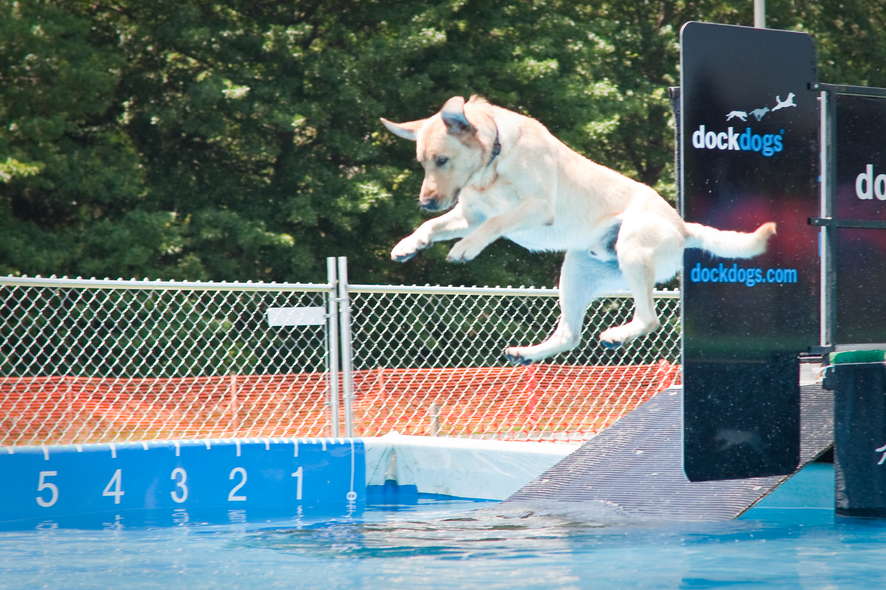
To plot the distribution of variable values for different groups, I used the maximum jump distance for several hundred dogs that participated in the SplashDogs (http://www.splashdogs.com/) ‘Super Air’ dock jumping competition during 2016. Dock jumping is essentially a long jump sport for dogs. Dogs run along a ~12 meter dock and jump into the water, usually chasing a toy. Jumps are measured from the edge of the dock to the point where the base of the dog’s tail first enters the water.
This post has three main steps: scraping the jump distance data, wrangling it, and plotting it. This post in particular could not be possible without all the resources and advice from Bob Rudis that are floating around the web. This includes posts on his blog, answers on random Stack Overflow questions, tweets, and his helpful R packages. I tried to add links to all the hrbrverse resources that helped me along the way at the end of this post. All the code here is fully reproducible, although you may need to install some packages first.
Web scraping
I did not find any Terms of Service prohibiting automated data grabbing or visualization by third parties anywhere on the SplashDogs website or in the site’s robots.txt file. Remember to always check if scraping is allowed and adhere to all Terms and Conditions. Here’s a brief guide on how to crawl the web politely. Take breaks between sequential requests, be kind to web servers when scraping, and just be nice in general. What would the dogs think if you crashed a site!
To scrape the data, I used rvest to interact with the web form on the site, making queries for event results by breed and year. I was only after data for a few breeds, and I managed to abstract the scraping into a function and use purrr (a first for me!) to iterate through a small vector of breeds that I chose following two main criteria: (personal bias, and representation in the competitions). I wanted to compare groups with several hundred entries (Labradors) vs groups with just a few (American Pit Bull Terriers).
# SCRAPING
# load libraries
library(rvest)
library(dplyr)

# set up parameters
# vector with the breeds we want data for
brVec <- c("Golden Retriever", "Labrador Retriever", "Belgian Malinois", "German Shorthaired Pointer", "Border Collie", "American Pit Bull Terrier")

# website to interact with
splurl <- "http://splashdogs.com/events/results/breedTool.php"
# session info
pgsession <- html_session(splurl)
# get the webform
pgform <-html_form(pgsession)[[2]]

# function to get a breed and wrangle the resulting DF
getbreed <- function(breed){
# fill the form, submit it, and get the table
# setting the values with the breed we want
filled_form <-set_values(pgform,
                         "year" = "2016",
                         "filter" = "0",
                         "air"  = "0",
                         "breed" = breed)
# submitting the updated form
resp <- submit_form(session=pgsession, form=filled_form)

# extract the table and add a variable with the breed
respDF <- resp %>%
  html_nodes("table") %>%
  .[[2]] %>%
  html_table(header=TRUE) %>%
  mutate(dog_breed=breed)
# pause between requests
Sys.sleep(sample(seq(6,10,0.5), 1))

return(respDF)
}

library(purrr)
# iterate using purrr
breedDFs <- map(brVec, getbreed)
Data wrangling
After putting the html tables into data frames, it was a straightforward process to summarize the data. I cleaned up some unnecessary spaces in the handler names, and kept only the maximum jump distance for each dog.
###################
# wrangling
library(magrittr)
# bind into a single df
allbreeds <- bind_rows(breedDFs)
# convert feet to meters
allbreeds <- allbreeds %>% mutate(jumpDist=round((Score*0.3048),2))
# remove 0-length jumps
allbreeds %<>% filter(jumpDist>0)

# see how many records per breed
allbreeds %>% count(dog_breed)

# merge multiple spaces in handler names
allbreeds$`Handler Name` <- gsub("\\s+", " ",allbreeds$`Handler Name`)
# summarize
allbreedsMax <- allbreeds %>% group_by(`Dog Name`,`Handler Name`,dog_breed) %>% summarize(jumpDist=round(max(jumpDist),2))
Plotting
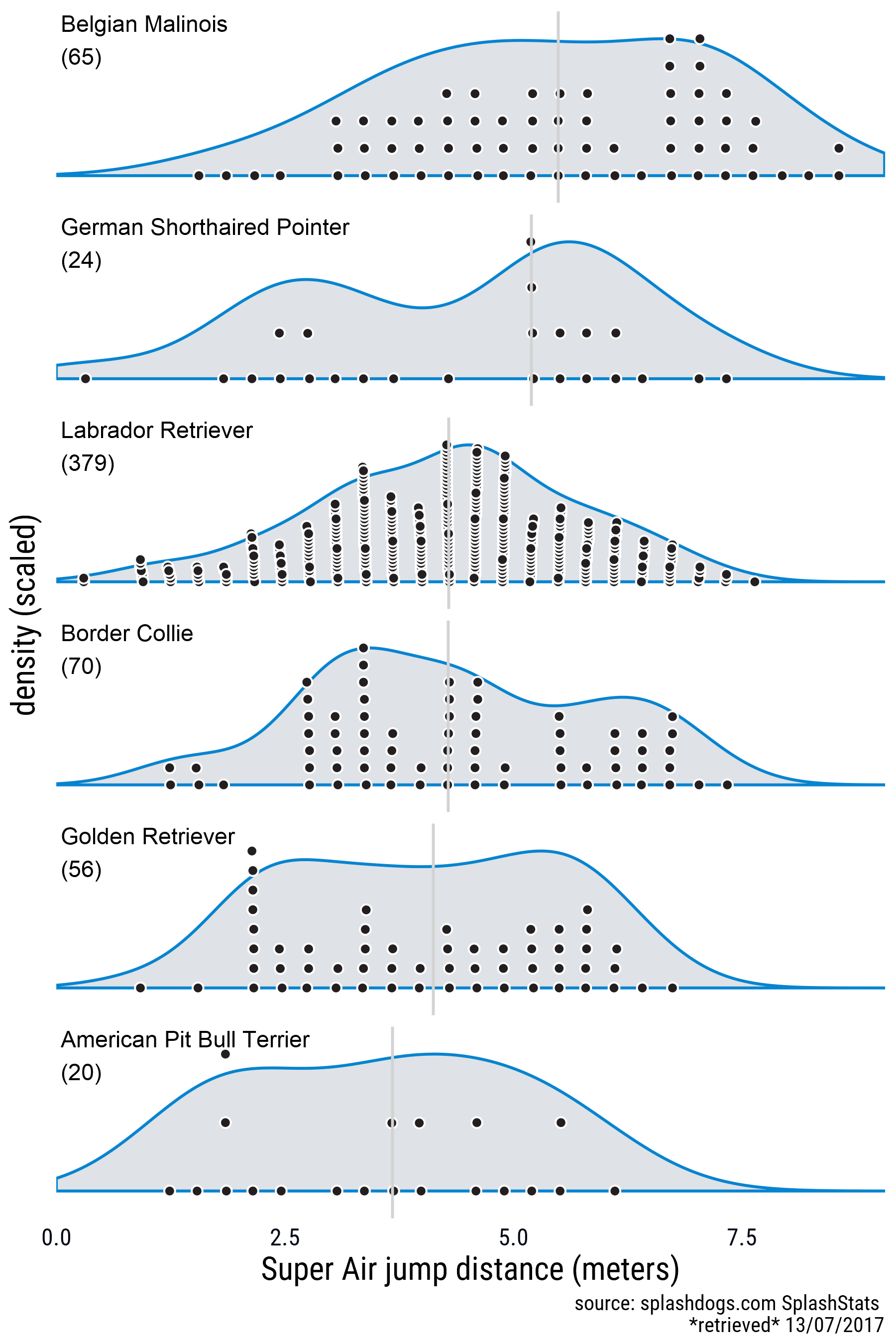
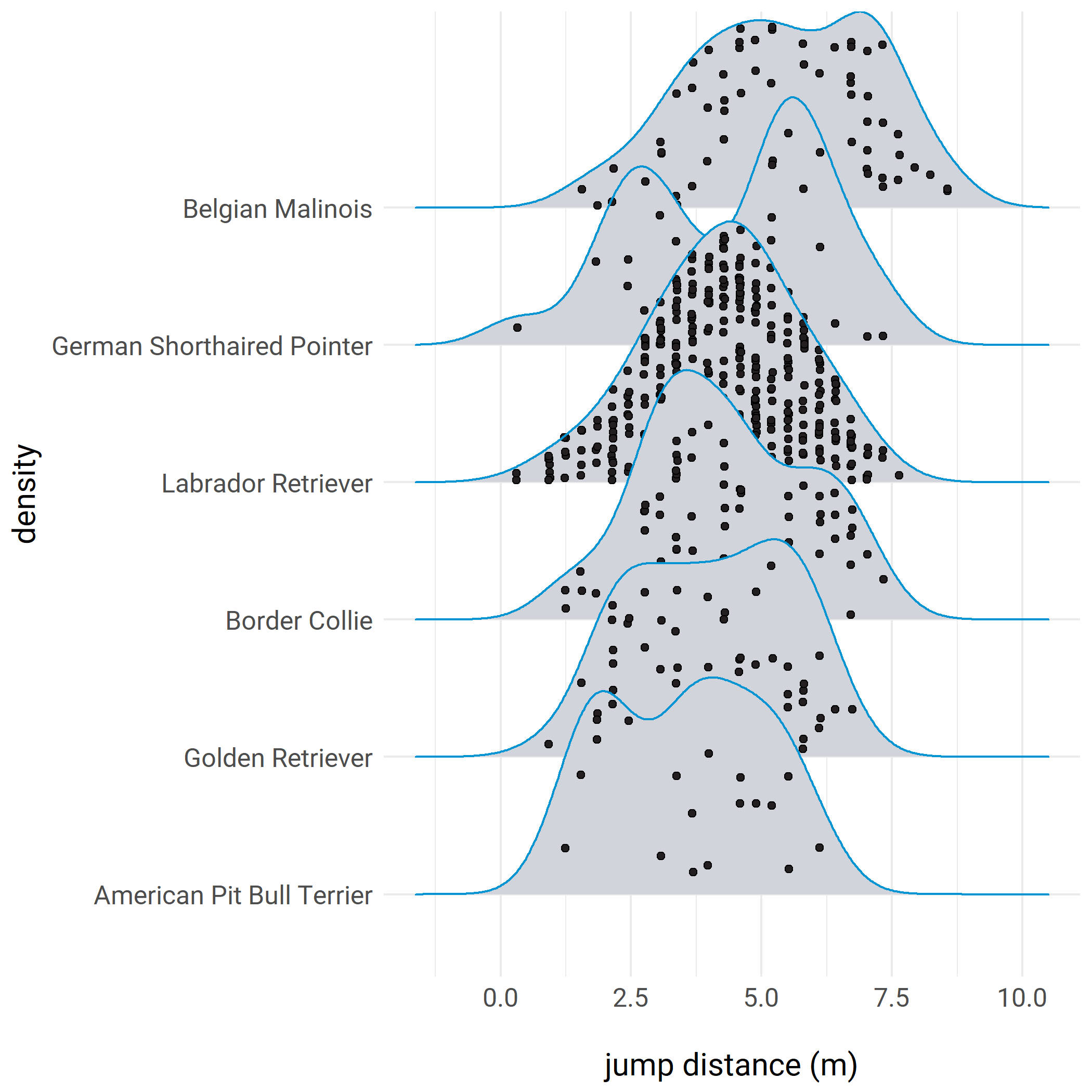
My approach was to create a one-sided beeswarm plot object for different groups and plot it over the respective density. I made two versions. One in which the densities and the point swarm are scaled, and one without scaling. I’m using faceting here, and I didn’t try to make the densities overlap. This code is clunky and it needs different data frames with pre-summarized information, but I’m happy with the results. The forcats package was very useful for reordering the factor levels whenever I had to arrange the groups for plotting.
Here’s the result with scaled densities and point swarms.
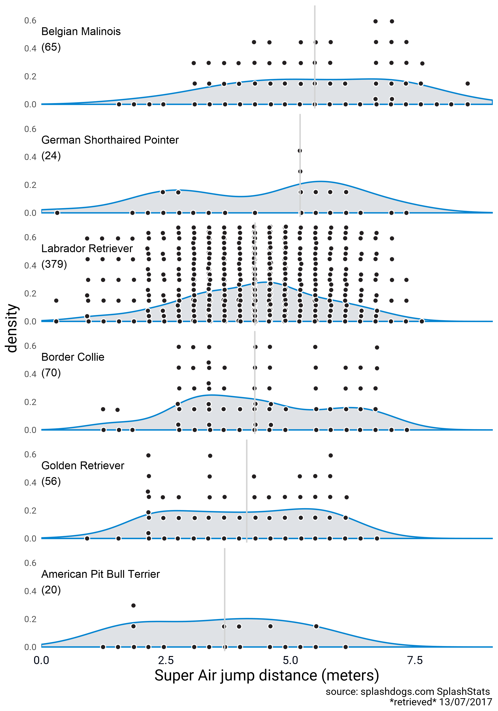
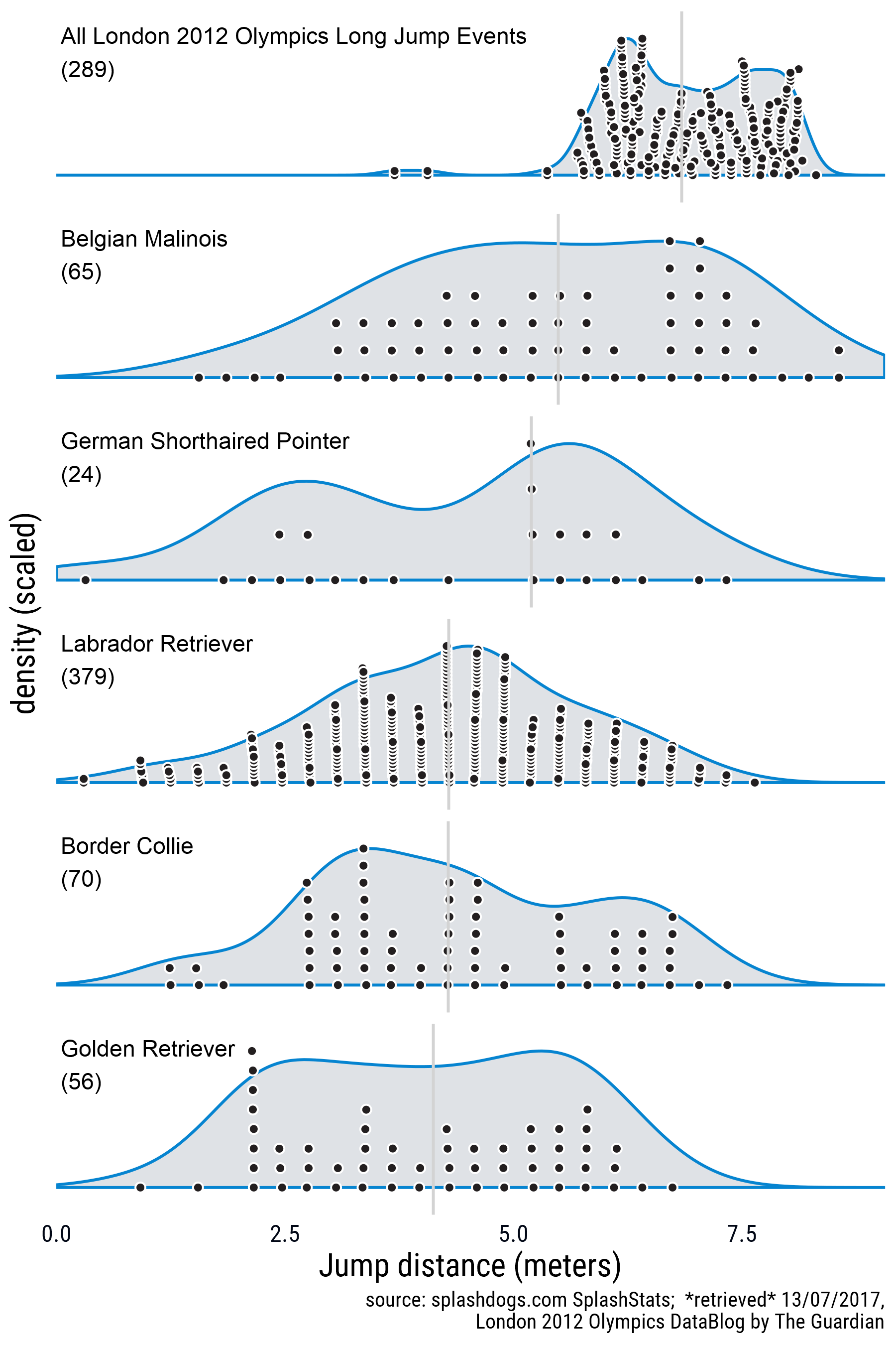
Here’s a version with unscaled densities and point swarms.
### PLOTTING
# packages
library(ggplot2)
library(beeswarm)
library(ggalt)
library(forcats)
library(magrittr)
library(hrbrthemes)
library(extrafont)

# beeswarm object
dogbees <- beeswarm(jumpDist~dog_breed,method="swarm",data=allbreedsMax,vertical=FALSE,
                    side=1, corral="none",priority="density")
# rename vars
dogbees %<>% rename(jumpDist=y, dens=x, breed=x.orig)
# scale beeswarm density
dogbees %<>% group_by(breed) %>% mutate(scDens=(dens-min(dens)) / (max(dens)-min(dens))) %>% ungroup()

# reorder so breeds are arranged by median jump distance
# as a new variable
dogbees$breedR <- fct_reorder(dogbees$breed,dogbees$jumpDist,fun=median,.desc=TRUE)

# presummarize median jump distances
medJumps <- dogbees %>% group_by(breedR) %>% summarise(med=median(jumpDist))

# data frame for the geom_text labels
bdata = data.frame(x=0.1, y=0.9,
                   lab=levels(fct_reorder(dogbees$breed,dogbees$jumpDist,fun=median,.desc=TRUE)),
                   breedR=levels(fct_reorder(dogbees$breed,dogbees$jumpDist,fun=median,.desc=TRUE)))
# labels with sample sizes
bdata <- left_join(bdata,count(dogbees,breedR)) %>% mutate(breedsamp=paste(breedR," ","\n","(",n,")",sep=""))
bdata <- left_join(bdata,medJumps) # for reordering
# reorder after the join
bdata$breedR <- fct_reorder(bdata$breedR,bdata$med,.desc=TRUE)

# plot
ggplot(dogbees)+
  facet_grid(breedR~.,scales = "free")+
  geom_bkde(aes(x=jumpDist,y=..scaled..), color="#0684D0",
            truncate=FALSE, fill="#D1D5DB",alpha=0.7,
            range.x = c(0,max(dogbees$jumpDist+0.5)))+
  geom_point(aes(x=jumpDist,y=scDens),
             shape=21, color="white",fill="#231F20",size=2)+
  geom_vline(data=medJumps,aes(xintercept=med),color="light grey")+
  geom_text(aes(x, y, label=breedsamp),data=bdata, hjust=0)+
  labs(x="Super Air jump distance (meters)", y="density (scaled)",
       caption="source: splashdogs.com SplashStats \n *retrieved* 13/07/2017")+
  scale_y_continuous(breaks = c(0,1),expand = c(0,0.2))+
  scale_x_continuous(expand=c(0,0))+
  theme_minimal(base_family = "Roboto Condensed")+
  theme(strip.text.y = element_blank(),
        panel.grid = element_blank(),
        axis.title = element_text(size=rel(1.4)),
        axis.text.y = element_blank(),
        axis.text.x = element_text(size=rel(1.3), color = "#020816"))


############## unscaled densities
# beeswarm object
dogbeesU <- beeswarm(jumpDist~dog_breed,method="swarm",data=allbreedsMax,vertical=FALSE,
                    side=1, corral="wrap",priority="density")

# rename vars
dogbeesU %<>% rename(jumpDist=y, dens=x, breed=x.orig)
# shift beeswarm density
dogbeesU %<>% group_by(breed) %>% mutate(densShifted= (dens-min(dens))) %>% ungroup()

# reorder so breeds are arranged by median jump distance
# as a new variable
dogbeesU$breedR <- fct_reorder(dogbeesU$breed,dogbeesU$jumpDist,fun=median,.desc=TRUE)

# presummarize median jump distances
medJumpsU <- dogbeesU %>% group_by(breedR) %>% summarise(med=median(jumpDist))

# data frame for the geom_text labels
bdataU = data.frame(x=0.17, y=max(dogbeesU$densShifted)-0.1,
                   lab=levels(fct_reorder(dogbeesU$breed,dogbeesU$jumpDist,fun=median,.desc=TRUE)),
                   breedR=levels(fct_reorder(dogbeesU$breed,dogbeesU$jumpDist,fun=median,.desc=TRUE)))
# labels with sample sizes
bdataU <- left_join(bdataU,count(dogbeesU,breedR)) %>% mutate(breedsamp=paste(breedR," ","(",n,")",sep=""))
bdataU <- left_join(bdataU,medJumpsU) # for reordering
# reorder after the join
bdataU$breedR <- fct_reorder(bdataU$breedR,bdataU$med,.desc=TRUE)


# plot
ggplot(dogbeesU)+
  geom_bkde(aes(x=jumpDist,y=..density..), color="#0684D0",
            truncate=FALSE, fill="#D1D5DB",alpha=0.7,
            range.x = c(0,max(dogbees$jumpDist+0.5)))+
  geom_point(aes(x=jumpDist,y=densShifted),
             shape=21, color="white",fill="#231F20",size=2)+
  geom_vline(data=medJumpsU,aes(xintercept=med),color="light grey")+
  labs(x="Super Air jump distance (meters)", y="density",
       caption="source: splashdogs.com SplashStats \n *retrieved* 13/07/2017")+
  scale_y_continuous(expand = c(0,.03))+
  scale_x_continuous(expand=c(0,0))+
  facet_grid(breedR~.)+
  theme_minimal(base_family = "Roboto")+
  theme(strip.text.y = element_blank(),
        panel.grid = element_blank(),
        axis.title = element_text(size=rel(1.4)),
        axis.text.x = element_text(size=rel(1.3), color = "#020816"))+
  geom_text(aes(x, y, label=breedsamp),data=bdataU, hjust=0)
For comparison, here’s a plot of the same data using geom_density_ridges() and some theming to make the plot look extra cool. It looks really crisp, and the default plots can be built with a single line of code. I suspect that what I’ve done with the beeswarm points can be made into a geom to accompany geom_density_ridges. If you’re good at ggproto let me know and we can try it out.
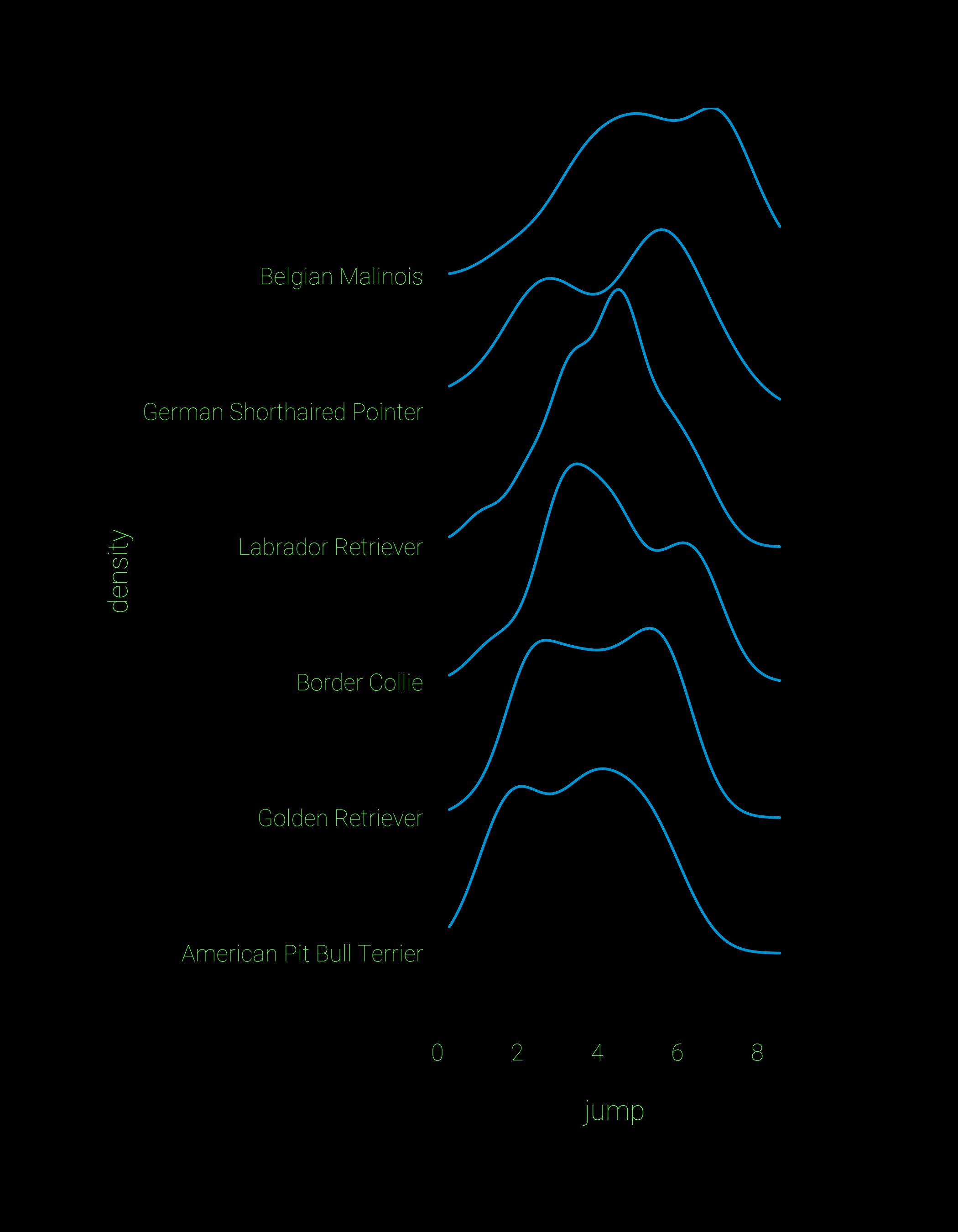
## ridgeline plot
library(ggridges)
dogbeesRev <- dogbees

ggplot(dogbeesRev)+
  geom_density_ridges(aes(x=jumpDist,y=fct_rev(breedR), height=..density..),scale=1.9,
           col="#0094D3",fill="black")+
  theme_minimal(base_family = "Roboto Thin") +
  labs(x="\njump",y="density")+
  theme(axis.title = element_text(size=rel(1.3),color="#5DFF4F"),
        axis.text = element_text(size=rel(1.1),color="#5DFF4F"),
        panel.grid = element_blank(),
        panel.background = element_rect(fill = "black"),
        plot.background = element_rect(fill = "black"),
        plot.margin = unit(c(2,3,2,2), "cm"))
Here’s an example with the new jittered_points argument in ggridges:
# after installing the latest version of ggridges
ggplot(dogbeesRev,aes(x=jumpDist,y=fct_rev(breedR)))+
  geom_density_ridges(aes(height=..density..),scale=1.9,
                      col="#0094D3",fill="#D1D5DB",jittered_points=TRUE,point_shape=21,
                      point_fill="#231F20")+
  theme_minimal(base_family = "Roboto") +
  labs(x="\njump distance (m)",y="density")+
    theme(axis.title = element_text(size=rel(1.3)),
        axis.text = element_text(size=rel(1.1)))
Finally, the visual appeal of ridgeline plots can make us get carried away, but as TJ Mahr and Matti Vuore pointed out, they can be used to show posterior distributions of parameter estimates.
hrbrverse resources
Packages:
ggalt package (for a nice kernel density geom)
hrbrthemes (crisp ggplot themes)
scraping blog posts:
Real Estate
Music Composers
Stack Overflow help:
Using geom_text with facet_grid
Advice on POST requests
Update 16/0/2017: After posting this I was very impressed with the jumping prowess of dogs in general so I decided to add a comparison with human jumping skills. I found data for the London 2012 Olympics in this Google Sheets document put together by The Guardian and used the googlesheets package to download the data and repeat the process. The new figure and the code for downloading the data are below:
Get the data by iterating through the sheets in the workbook. See this GitHub issue for a better explanation.
library("googlesheets")
library("purrr")
library("dplyr")

# sheet url
gsobjIOC <- gs_url("https://docs.google.com/spreadsheets/d/1eTjnarkVF5l1xnPVYzOJ6p0DE64_6FMHY-fyHsTqyrk/edit#gid=1")

# get all sheets in doc
lond2012 <-
gsobjIOC %>%
  gs_ws_ls() %>% # names of all the sheets in the document
  set_names %>%  # for naming the DFs
    map(gs_read,ss=gsobjIOC) # iterate

# remove problematic column
lond2012 %>% map(select(-Position))
# bind dfs
lond2012df <- bind_rows(lond2012)
If anything isn’t working please let me know.